TIMELINE
3 weeks
PLATFORM
End to end App
TOOLS
Figma
Zoom
Google Forms
Maze
Adobe Illustrator
Adobe Photoshop
MY ROLE
Research
UI Design
Design
Prototyping
Usability Testing
The Brief
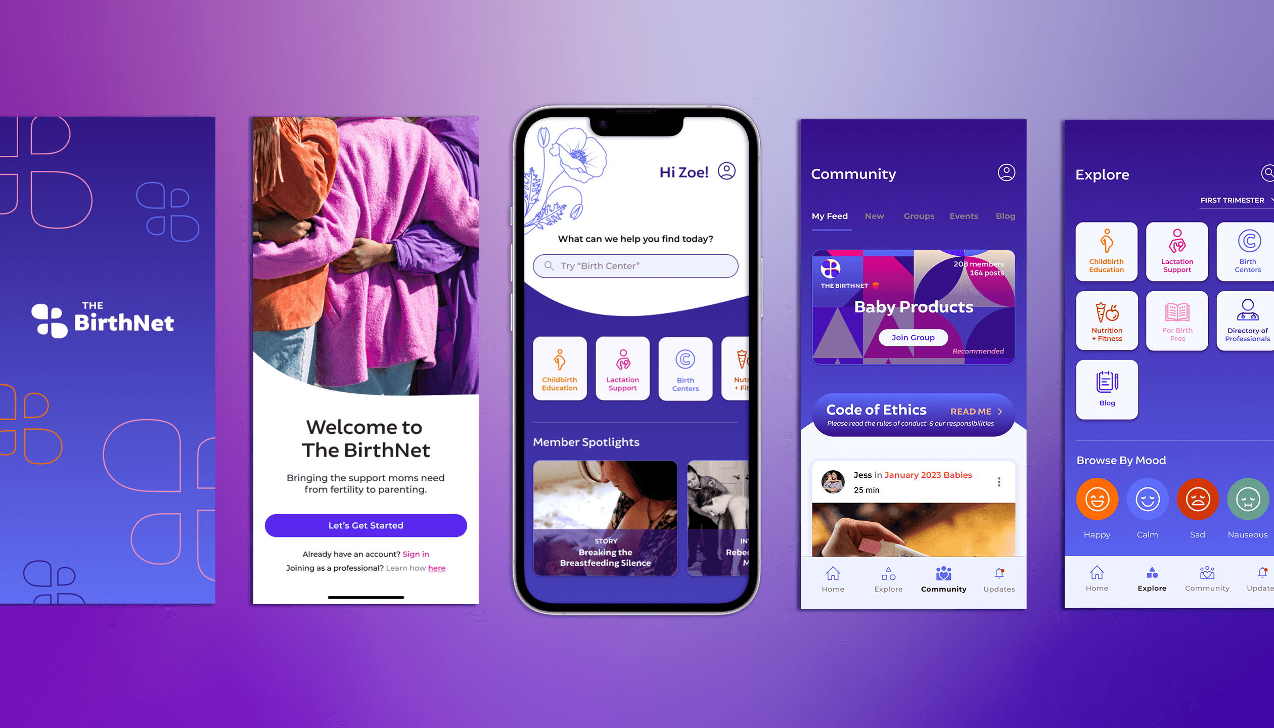
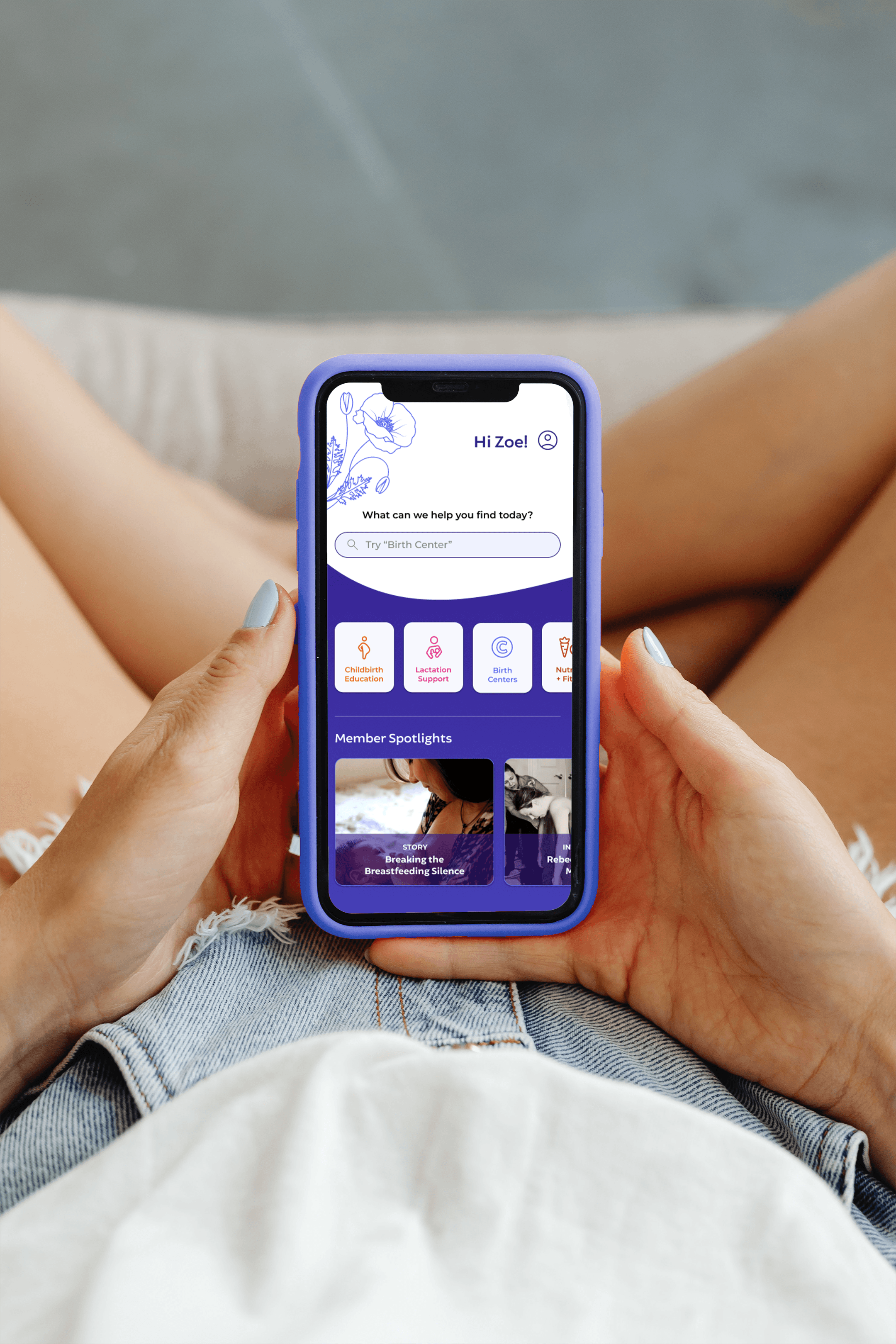
The BirthNet helps to support moms from fertility to parenting by connecting them with professionals, a supportive community, and resources. The app will also include partners advocating for mothers. In the long term, this app will become a hub for all go-to's for mothers & parents.
I created the end-to-end app on the ios platform.
Click to view Final Prototype
Scope of Work
Birth Network will be an app that connects all the birth networks in various states all in one app.
Users can search for the support they need, like a professional, a local birth network, or a community to guide them along their journey. They’ll have access to medical advice along with relative resources.
Goal
The ultimate goal of this project is to fill this space that is needed by mothers, parents, and caregivers; a one-stop place to find answers, connect with a local community and get support.
Measuring Success
Users can successfully find the support or answers they need
The BirthNet becomes the go-to app for pre-pregnancy and post-pregnancy
Recruit new users
Research & Analysis
Step 1:
Conduct external secondary research to gather relevant findings
Step 2:
Do competitive analysis, while exploring features and offerings against competitors
Step 3:
Conduct 1:1 script user interviews, surveys and card sorting to gain insights on their experiences
Step 4:
Use research to build a user persona and develop branding
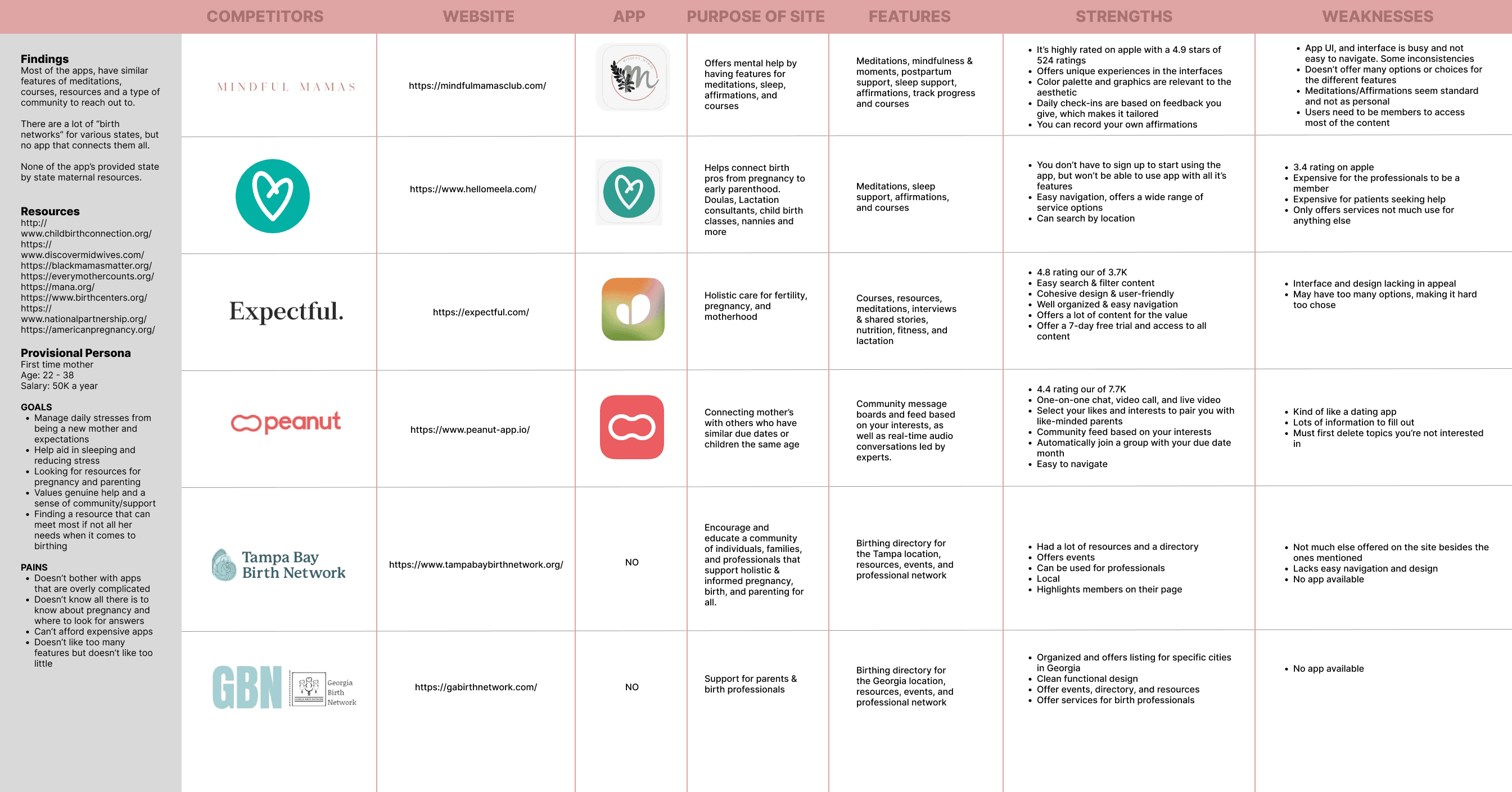
Competitive Analysis
(click image to enlarge)
Most of the apps, have similar features of meditations, courses, resources and a type of community to reach out to. There are a lot of “birth networks” for various states, but there is no app that connects them all. None of the app’s provide state by state maternal resources.
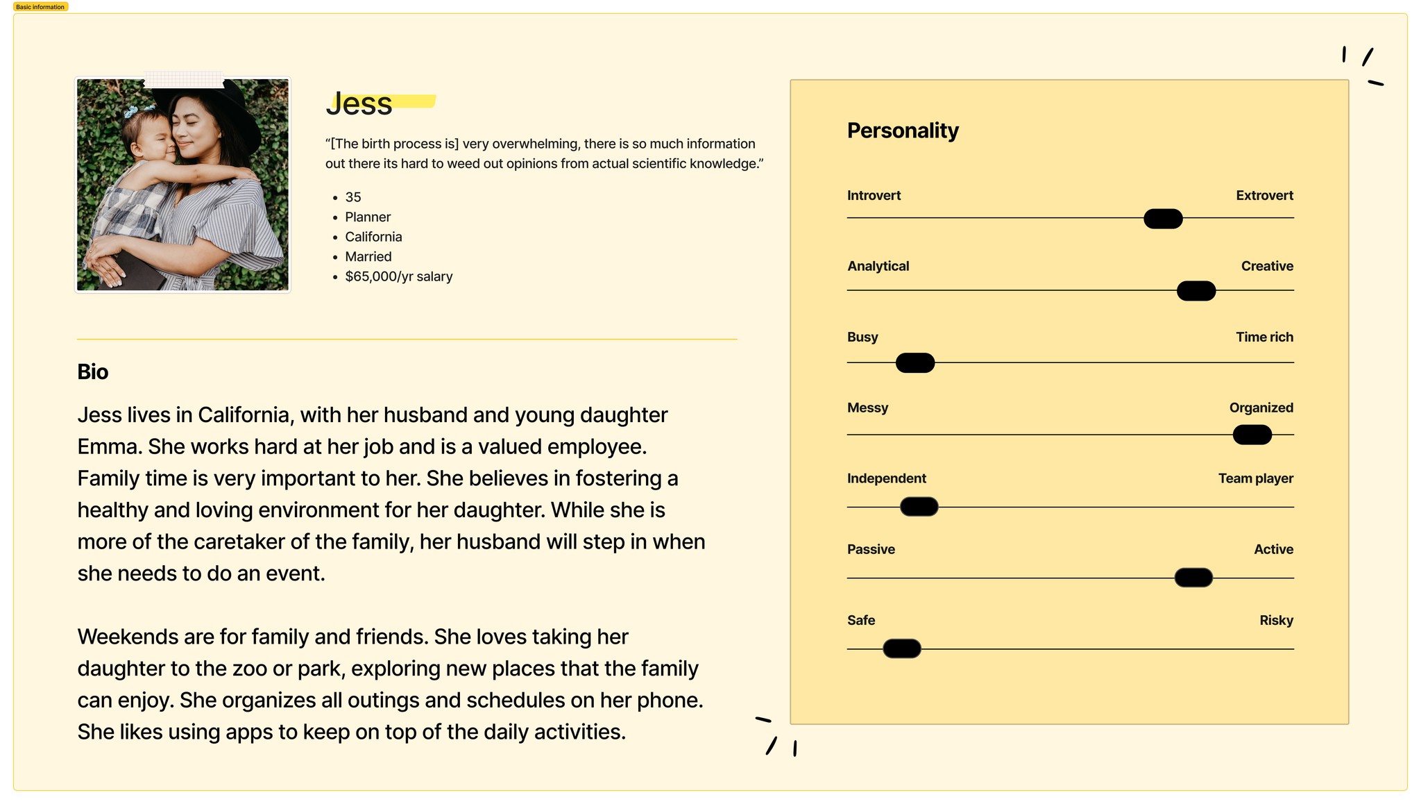
Defining the Personas
(click below image for full persona)
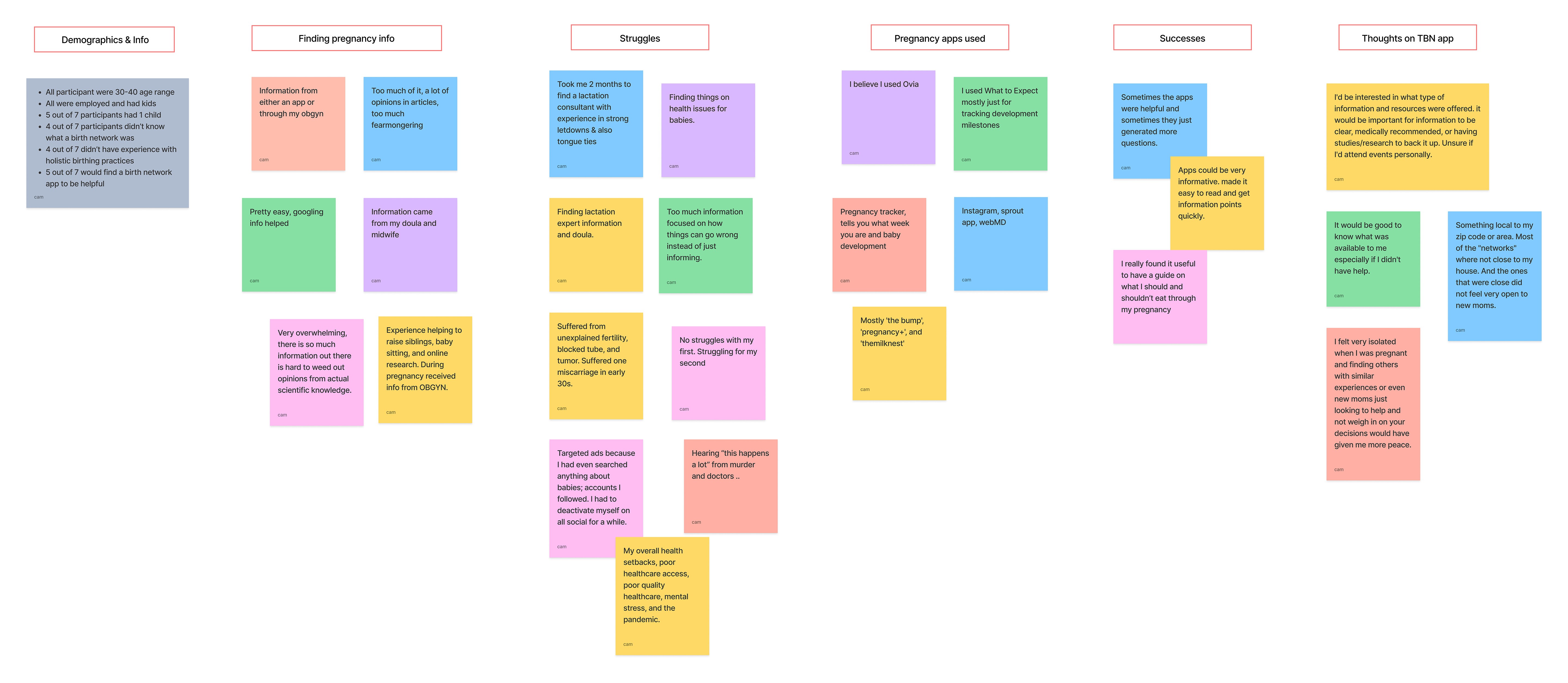
The overall consensus majority of the interviewees would find the app useful based on the proposed features. Information that was cleared by a professional or medical personnel was placed with high importance.
All participant were 30-40 age range
All were employed and had kids
5 out of 7 participants had 1 child
4 out of 7 participants didn’t know what a birth network was
4 out of 7 didn’t have experience with holistic birthing practices
5 out of 7 would find a birth network app to be helpful
Survey & Affinity Map
(click image to enlarge)
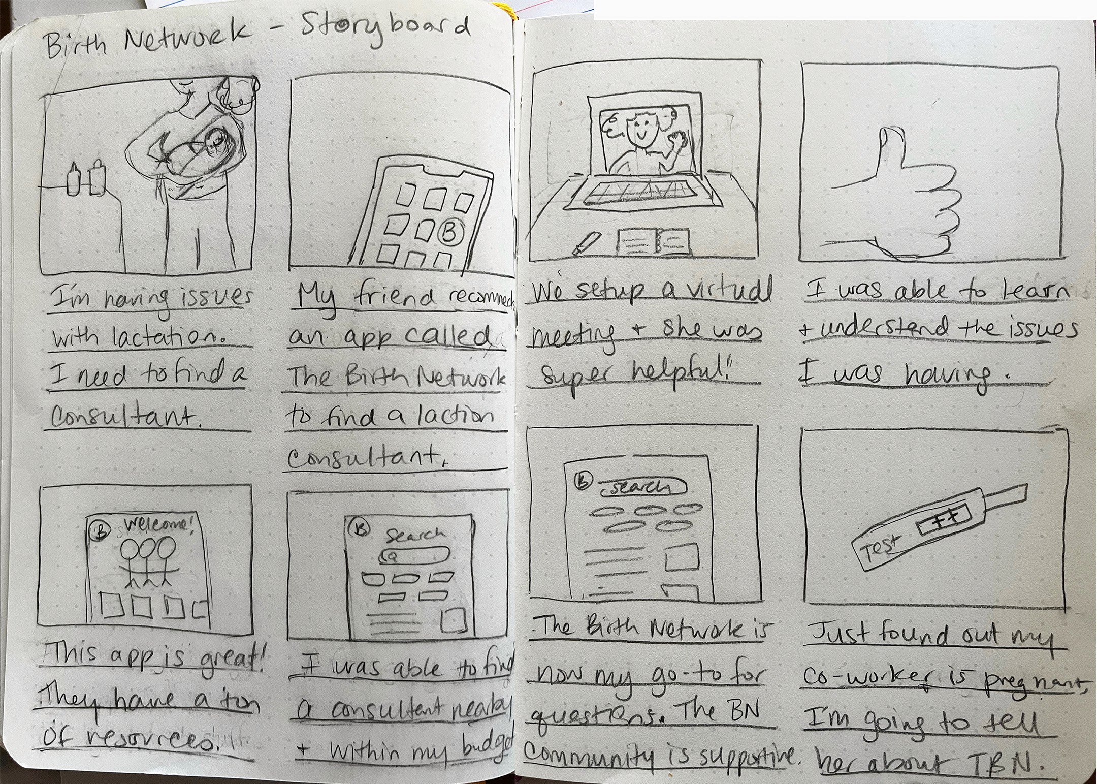
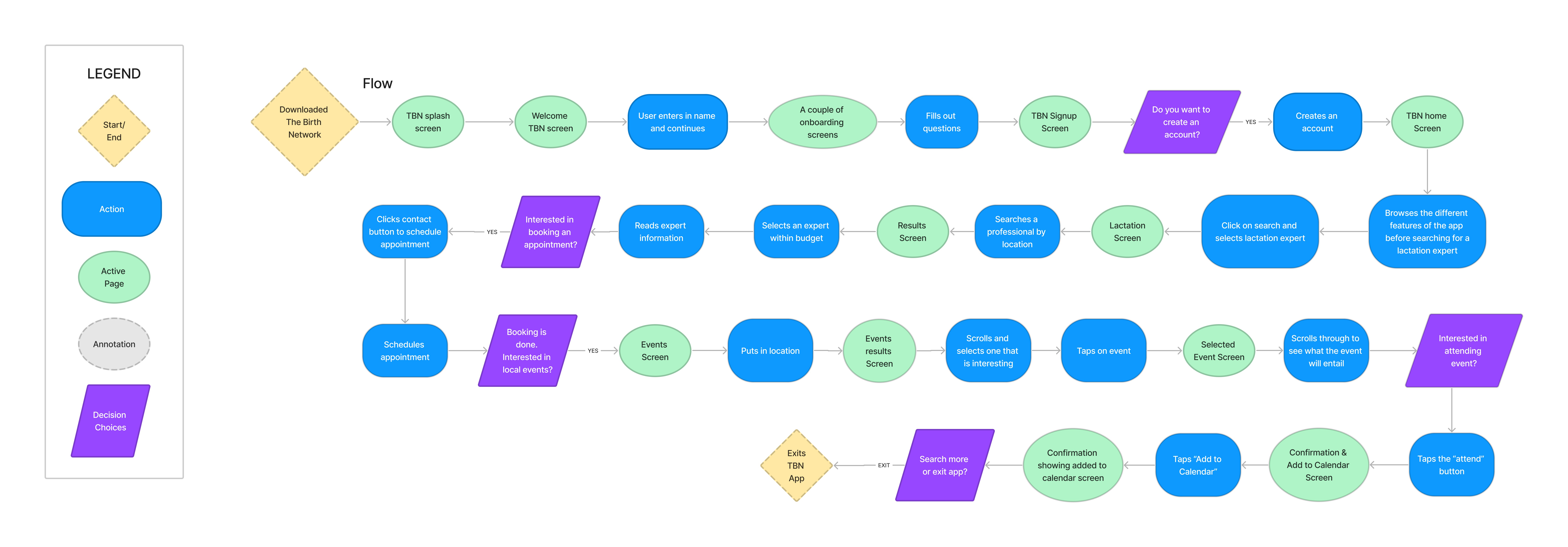
Storyboarding & Mapping Out the Flow
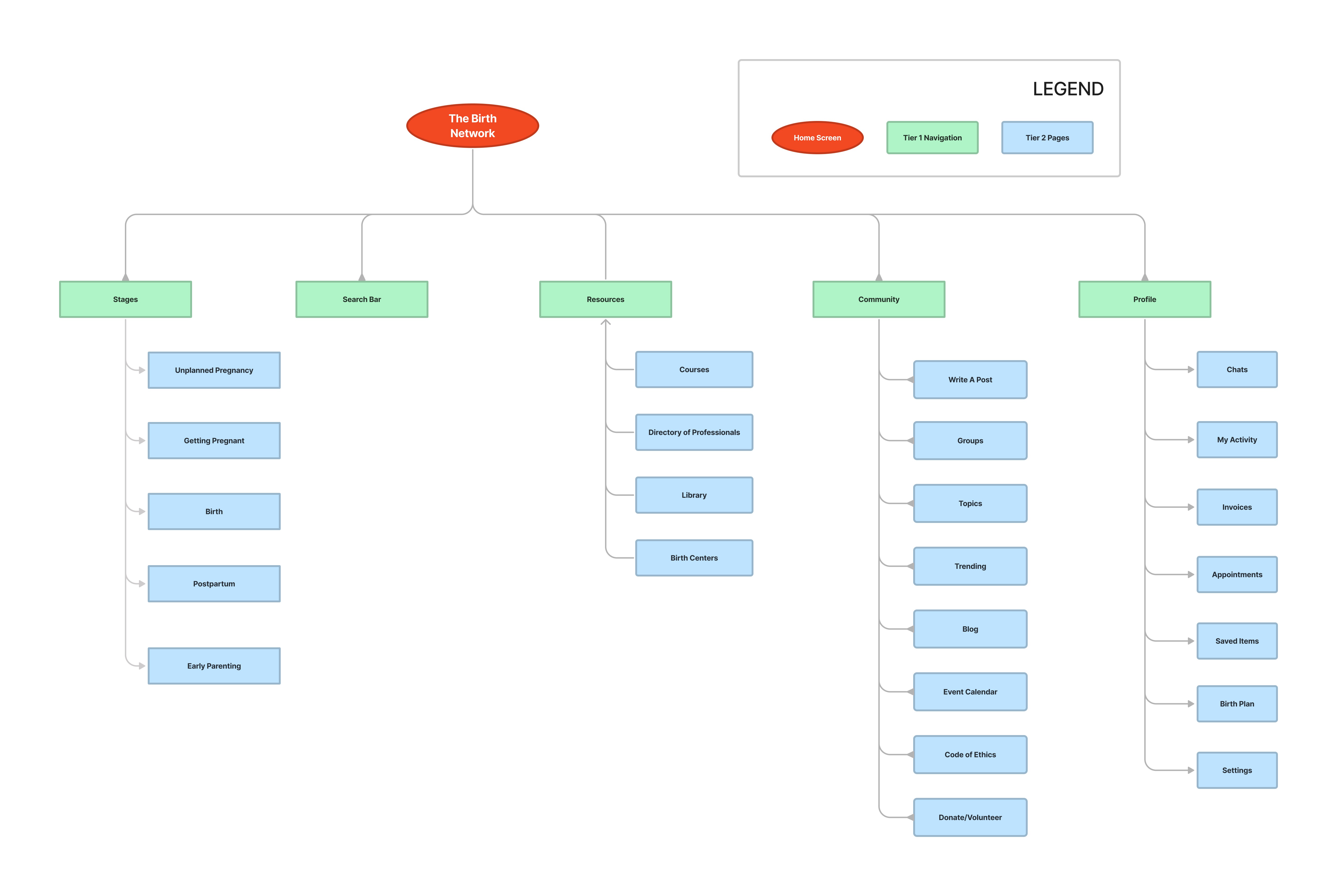
Information Architecture
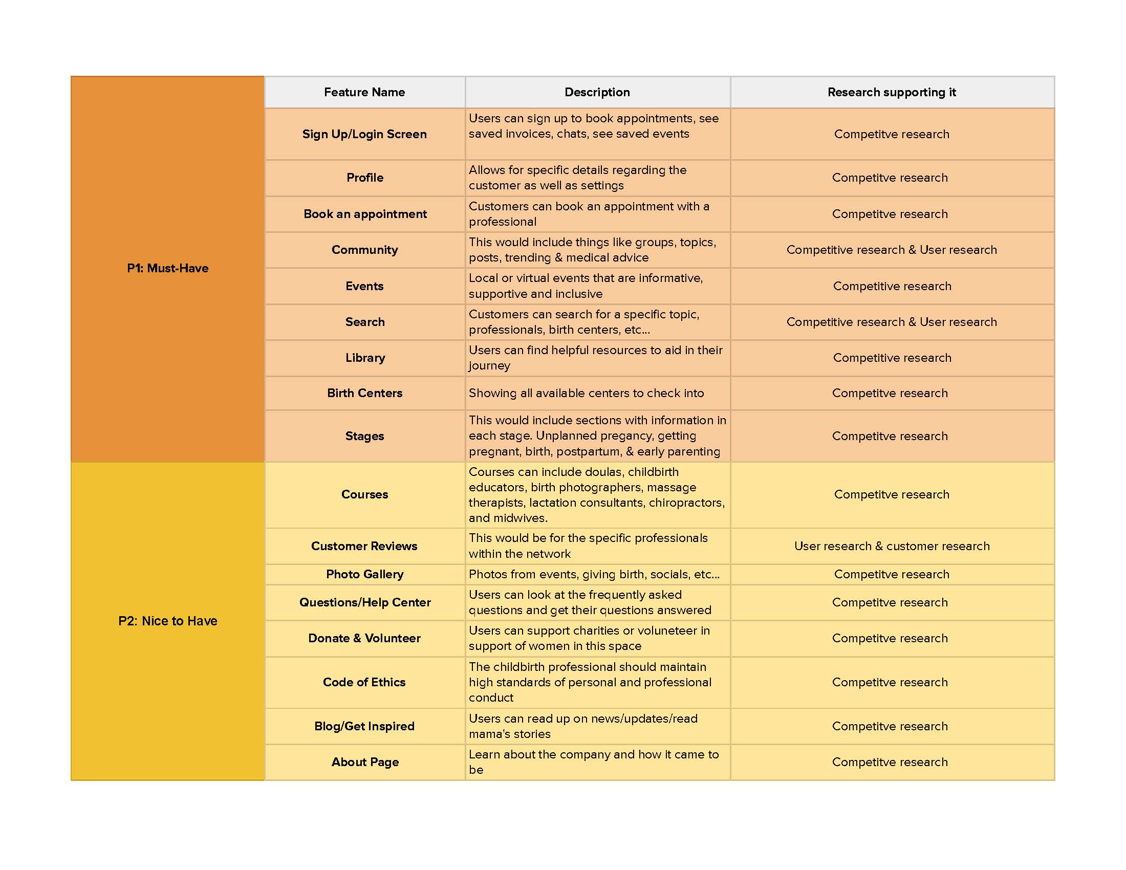
Product Roadmap
In my research, I found that search by stages was key as information would be different for each stage. So the Must-Haves were the priority, and then broke it down from there.
Once the app was in development, in the long term I thought it important to include a membership for professional and users to access more, which could include careers, mentorship, networking opportunities and scholarships.
(click image for full PDF file)
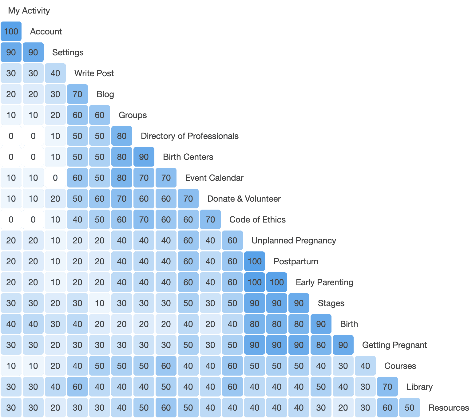
Card Sorting
I conducted a card sort of 20 items. It was a hybrid card sort where I provided 2 groups (Profile & Community) and in the directions I asked participants to provide additional groups or rename groups to what made sense to them.
First finding was 6 out of 10 participants only used the 2 original groups.
Second finding there were similarities with their organizing. For example 2 of the participants added a Resources group and 2 other participants added a “Learning” group.
Results
Site Map
(click image to view file)
From my card sort, I was able to organize my navigation for the app.
Since the app would have tons of resources and information, the card sort helped to solidify my original thinking of how to organize the content.
Conceptualizing the Brand
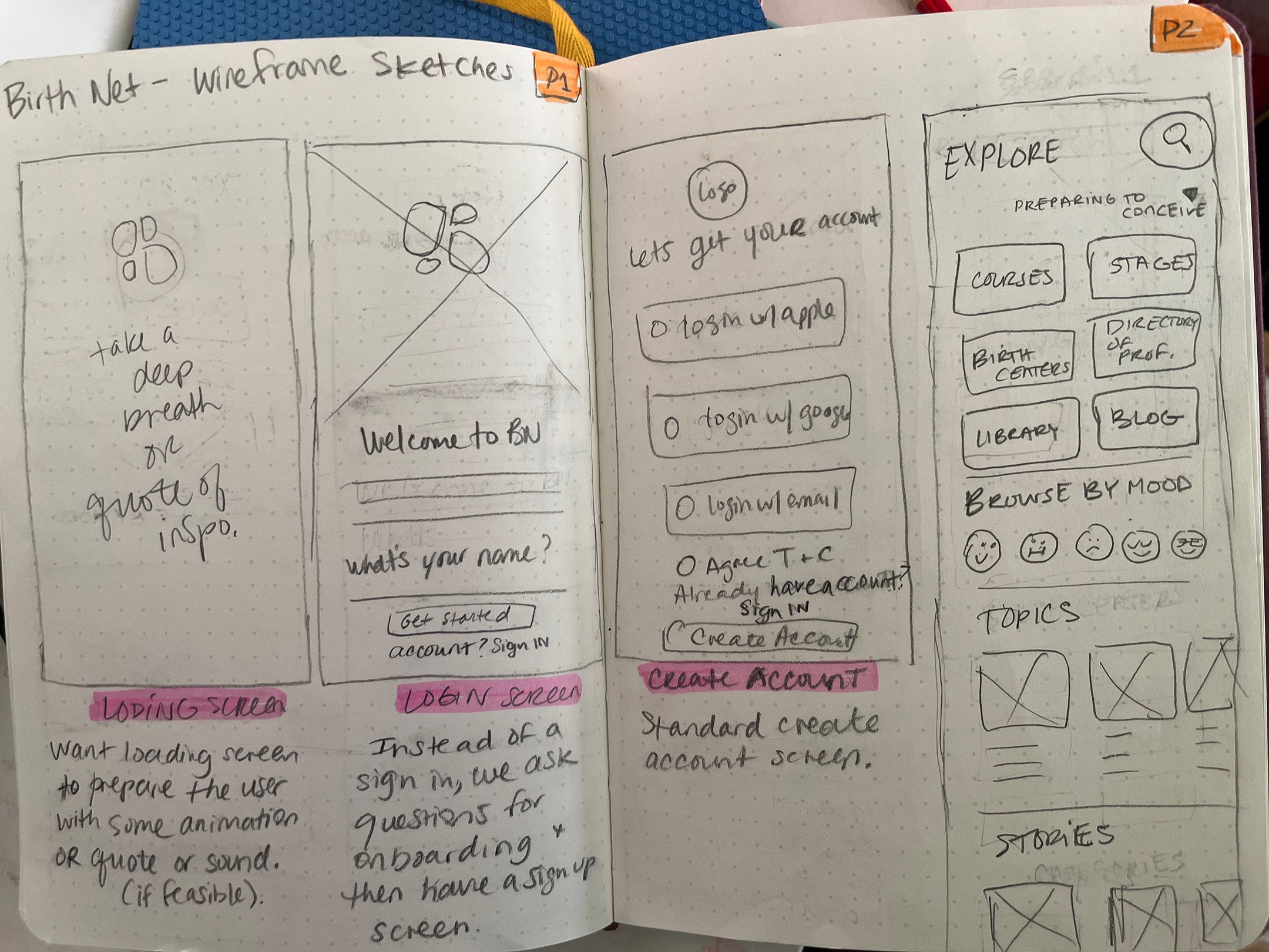
Using my pattern & UI analysis, I sketched out the lofi wireframes main screens. These screens would be my starting point to visualize and get my ideas down on how I'd like the app to function.
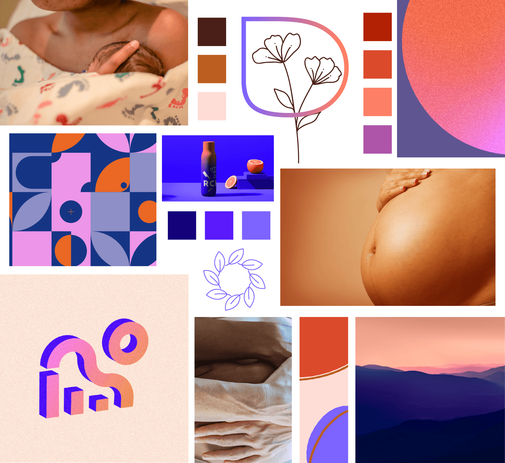
Mood board & Logo
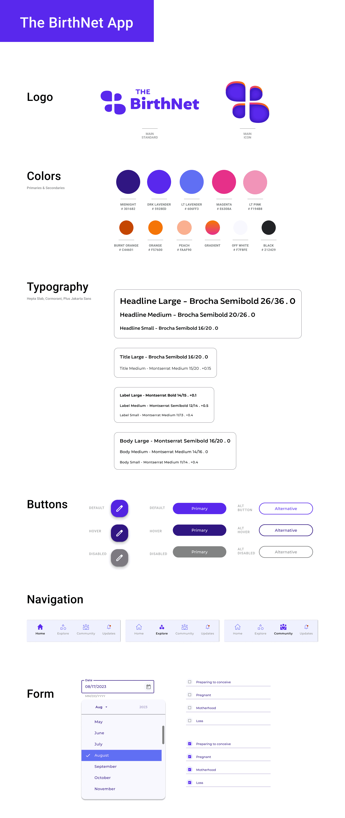
After creating a mood board and analyzing competition, I began designing the UI elements that would serve as the framework for all of my designs.
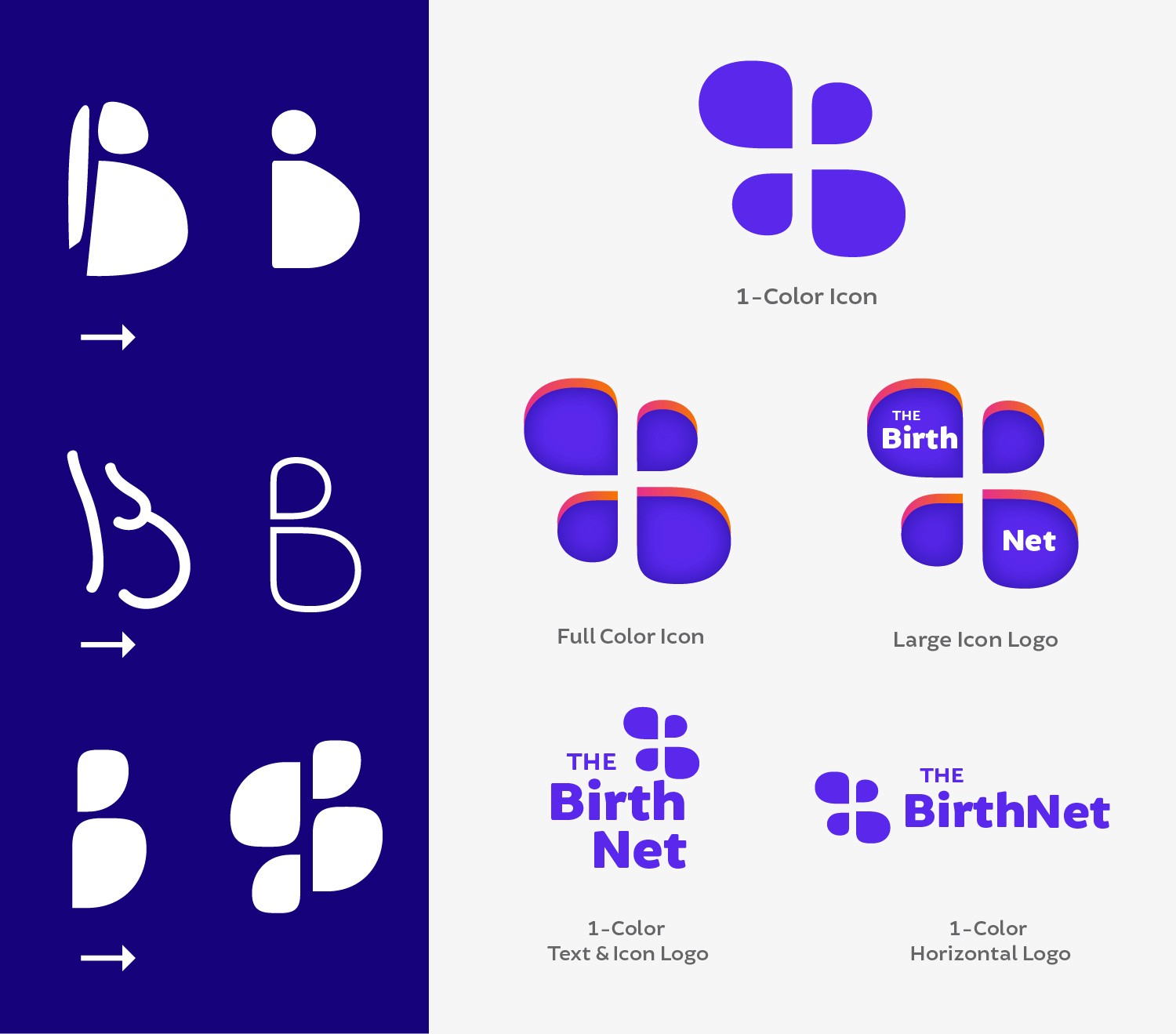
For the logo, I wanted to play with the letter “B” to create recognizable visual to associate with pregnancy. Once I got the shape of the B, I flipped and reversed the B to connect the idea of a network/connection.
The color palette was going to have cool and warm tones, but lean more towards a calm lavender hues. All the colors fall within the accessibility ranges.
Wireframes
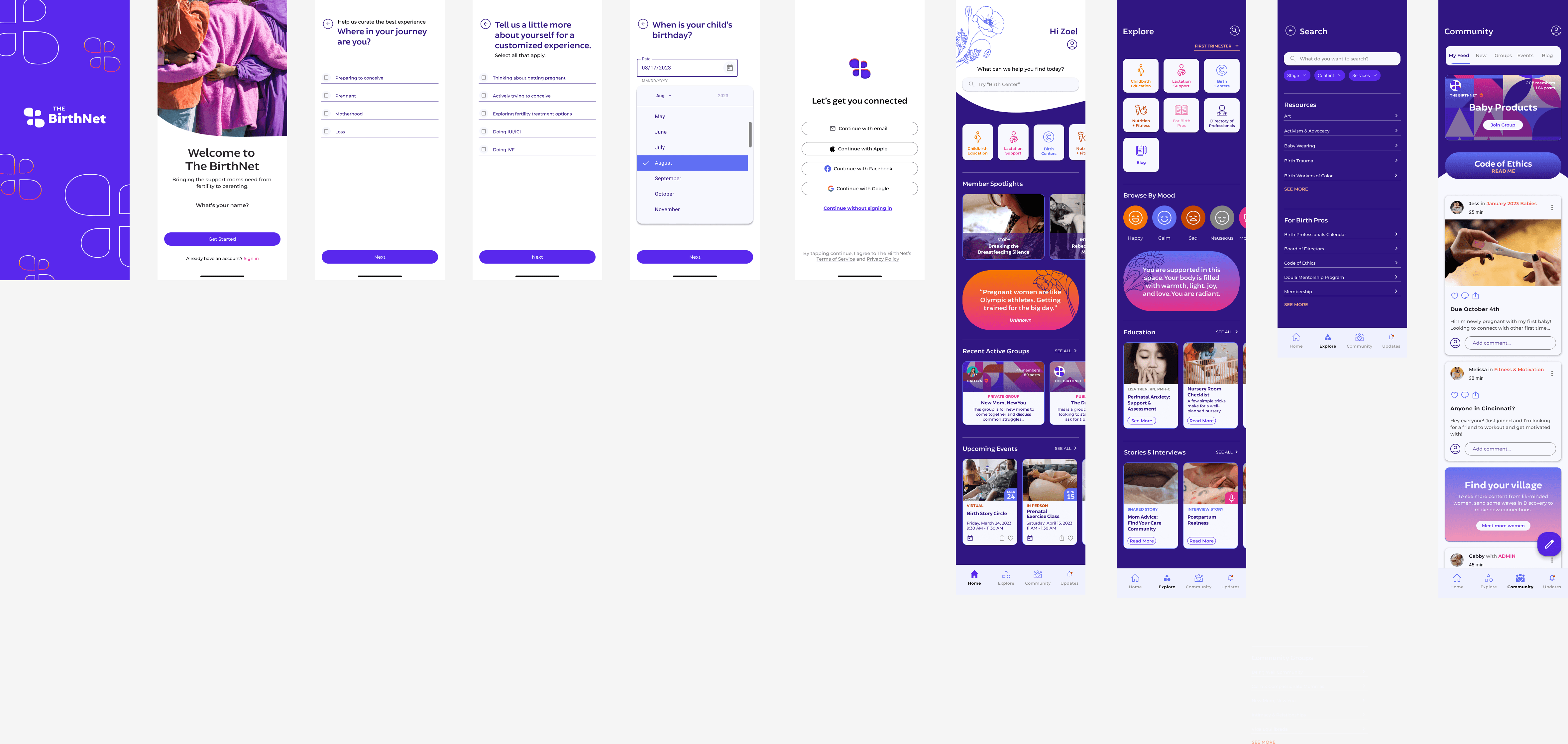
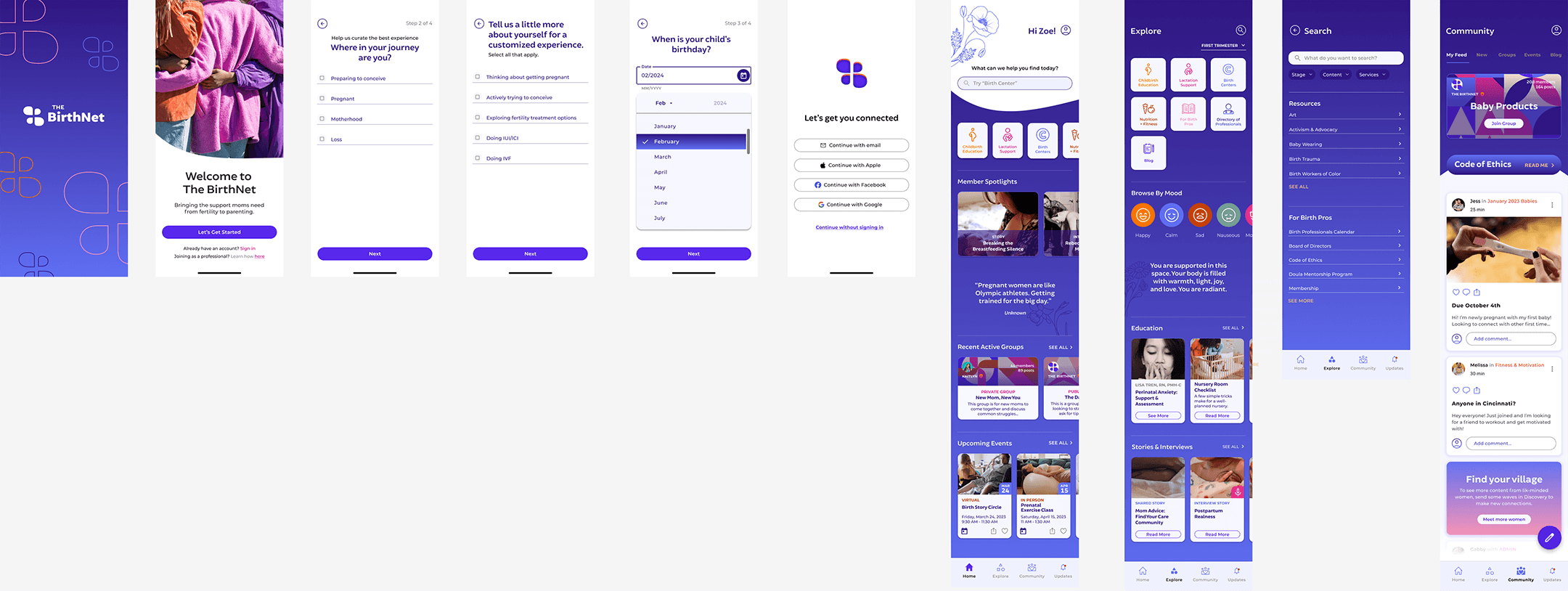
My HiFi wireframes show the main ideas I wanted to get across based on my roadmap, to aid in building out the the prototype to test.
There were some iterations from the original, like accessibility or contrast issues.
Original
Final
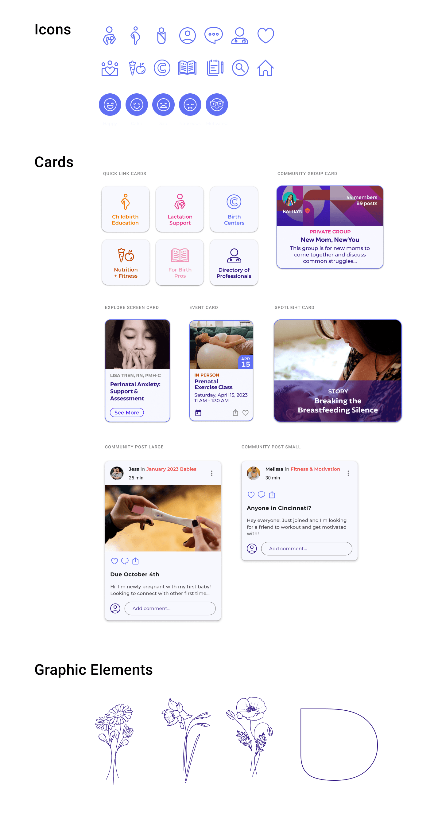
UI Kit
(click image to view file)
The vision for the app was to emote a sense of calm and trustworthiness with a touch of warmth. My color palette & fonts lend to that experience.
I wanted the main buttons and cards to have a subtle tint of the lavender color for a soft finish. The graphic elements I used are flowers to signify growth.
Testing & Iterations
Unmoderated Usability Testing
Objective
Uncover if there are design inconsistencies and usability problems
Test overall flow and ease of navigation
Test the proposed app for credibility
Learn about the user’s behaviors and preferences. Are there any points of confusion, difficulty, or hesitation?
Find opportunities to improve the design
Test the flow of the app and ease of connecting with a professional
Methodology
Conducting a usability test through Maze to test my product. Will collect satisfaction assessment, and suggestions for improvements
Quantitative usability testing
Goal
Have participants complete the tasks without error or confusion. Evaluate participants' feedback to iterate any areas that had pain points. Get feedback on the overall design and flow of the app.
Educational Onboarding
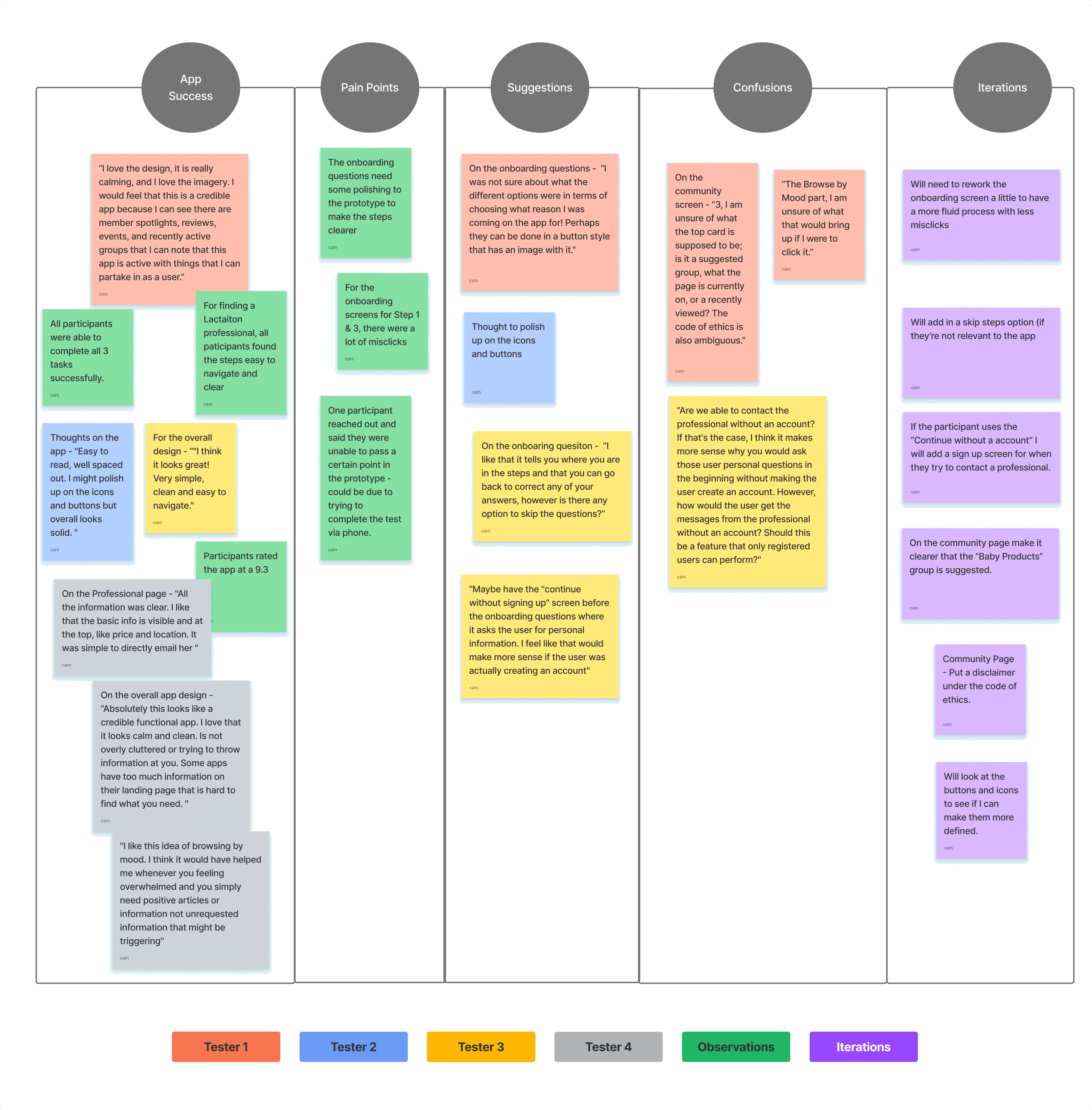
After conducting my usability tests, I created an affinity map with key insights, behaviors, and findings during the tests.
100% of participants completed the proposed tasks. All participants commented on the credibility and professional look, complimenting the design in flow of the app.
Successes
“I love the design, it is really calming, and I love the imagery. I would feel that this is a credible app because I can see there are member spotlights, reviews, events, and recently active groups that I can note that this app is active with things that I can partake in as a user."
Pain Points
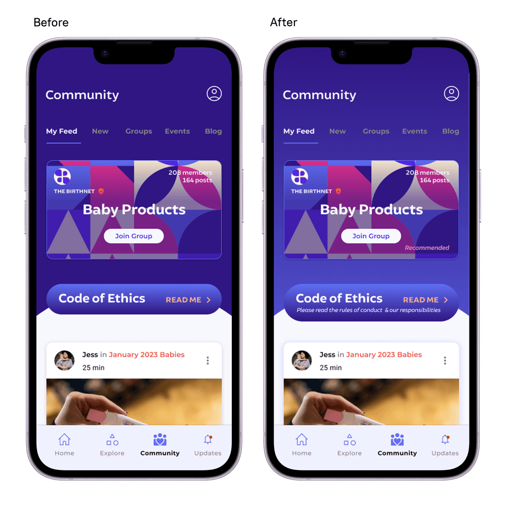
On the community screen - “Score of 3, I am unsure of what the top card is supposed to be; is it a suggested group, what the page is currently on, or a recently viewed? The code of ethics is also ambiguous."
Improvements
On the onboarding question - “I like that it tells you where you are in the steps and that you can go back to correct any of your answers, however is there any option to skip the questions?”
Insights
Revised Prototype
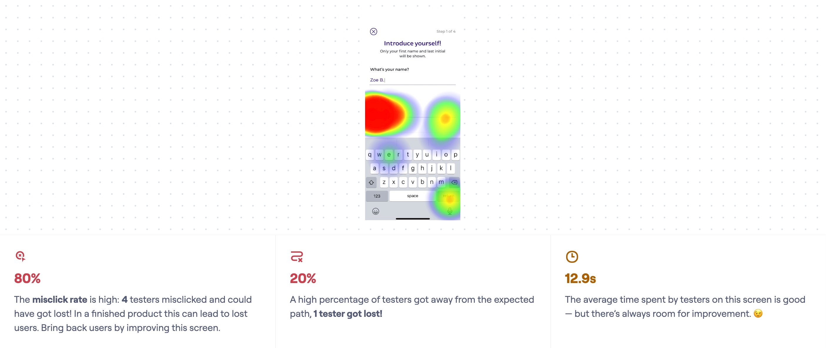
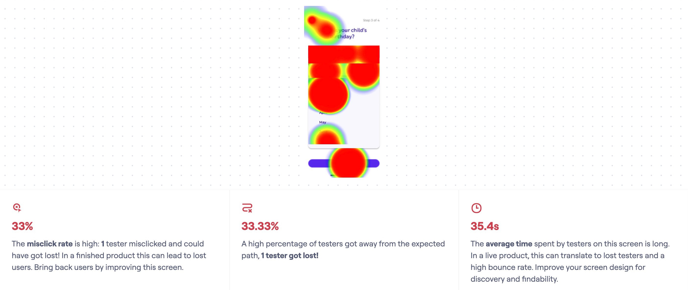
Based on feedback the users provided and the heat map of where there were misclicks, I prioritized these key changes:
Quantitative usability testing
Changed the onboarding screen a little to have a more fluid process with less misclicks
Enlarged the home screen buttons and icons
Added in user options for skipping some of the onboarding screens
Edited the Community page to include a disclaimer for the Code of Ethics.

