TIMELINE
6 weeks
PLATFORM
Responsive App
TOOLS
Figma
Zoom
Google Forms
Adobe Illustrator
Adobe Photoshop
MY ROLE
Research
UI Design
Design
Prototyping
Usability Testing
The Brief
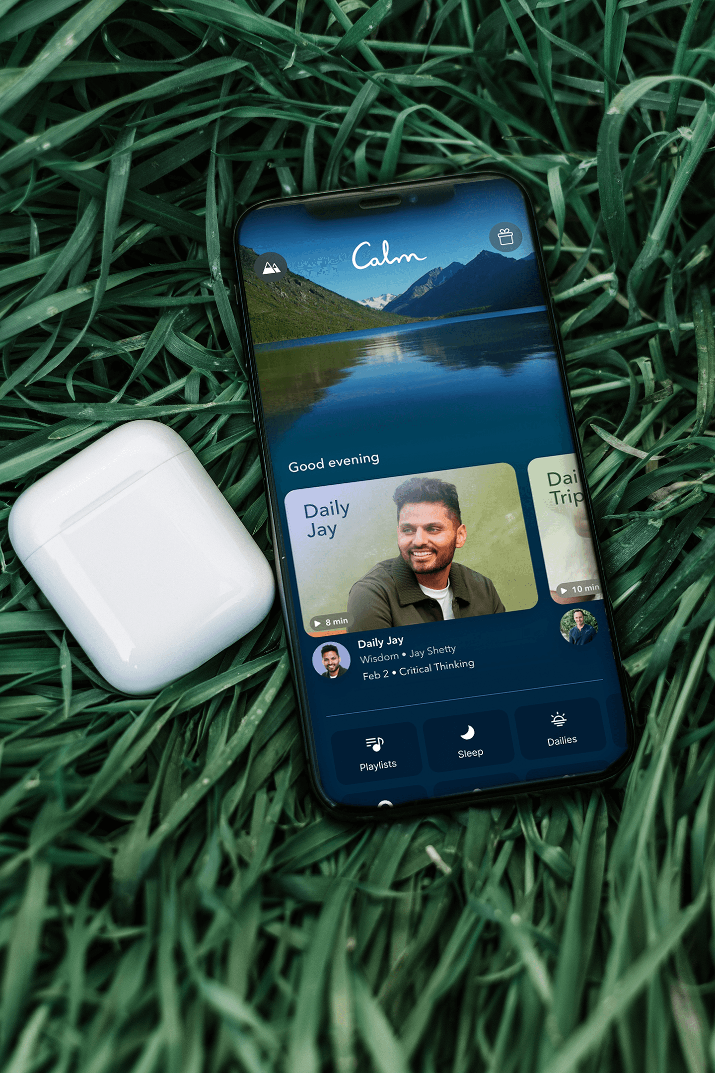
Calm is the #1 app for Sleep, Meditation, and Relaxation, with over 100 million downloads and over 1.5M+ 5-star reviews. They offer meditation, sleep stories, music, and much more.
I am proposing a customized feature where the user can create a personalized playlist, which will allow users the ability to curate their own playlists.
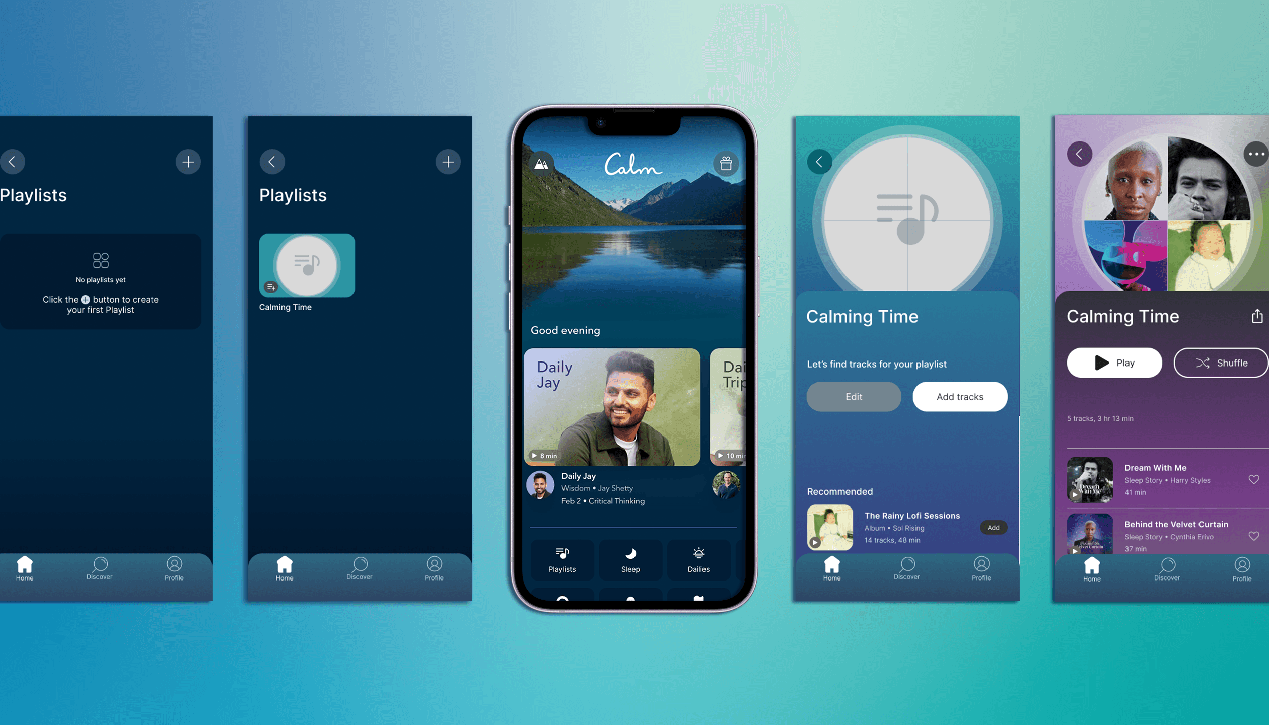
Click to view Final Prototype
Scope of Work
Add a feature to the home screen of the Calm app
Show how customization can be achieved
Goal
The ultimate goal of this project is to allow users to have more freedom in curating their own collections, based on their preferences and likes
Measuring Success
Users are pleased to have this added feature and utilize it
Calm continues to be relevant & on trend with the competition
Recruit new users, as well as retain existing ones
Research & Analysis
Step 1:
Conduct external secondary research to gather relevant findings
Step 2:
Do competitive testing, while exploring features and offerings against competitors
Step 3:
Conduct 1:1 script user interviews and surveys
Step 3:
Use research to build user persona and write user story
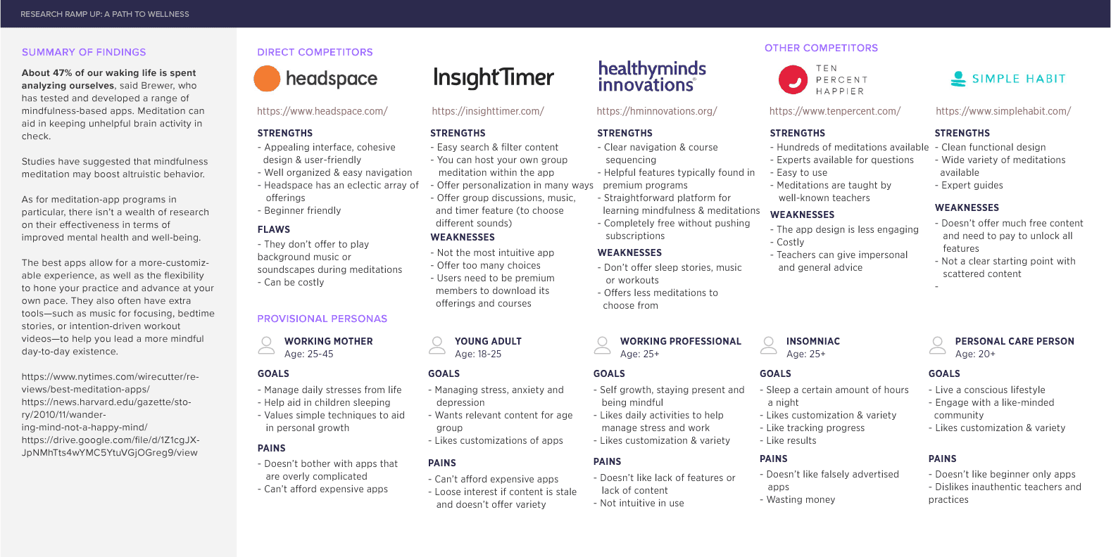
Competitive Analysis
(click image to enlarge)
About 47% of our waking life is spent analyzing ourselves, said Brewer, who has tested and developed a range of mindfulness-based apps. Meditation can aid in keeping unhelpful brain activity in check.
The best apps allow for a more-customizable experience, as well as the flexibility to hone your practice and advance at your own pace. They also often have extra tools—such as music for focusing, bedtime stories, or intention-driven workout videos—to help you lead a more mindful day-to-day existence.
https://www.nytimes.com/wirecutter/reviews/best-meditation-apps/
https://news.harvard.edu/gazette/story/2010/11/wandering-mind-not-a-happy-mind/
1:1 Interview Insights
Based on my interviews, the overall consensus from the interviewees was they used the Calm app for the purposes they’re known for: meditation, instilling calmness, and sleep.
All have made personalized playlists that they used daily
2 of the 3 participants thought curated playlists could be nice dependent on mood
2 of the 3 participants said a customizable playlist would be a nice addition for easier access and personalization
Affinity Map
(click image to enlarge)
Information Architecture
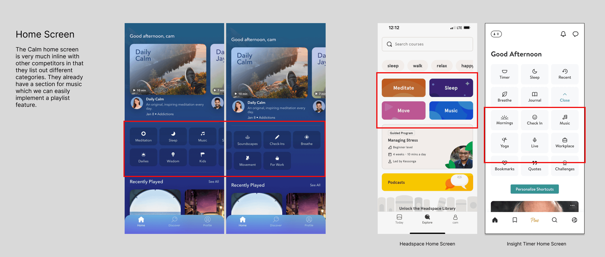
Pattern & UI Analysis
(click image for full analysis)
From my competitive analysis, I picked Headspace and Insight Timer as my main analyzation for how to add in proposed feature.
My solution to introduce the playlist feature would be to place on the home screen under the music button or more desired area after testing with users.
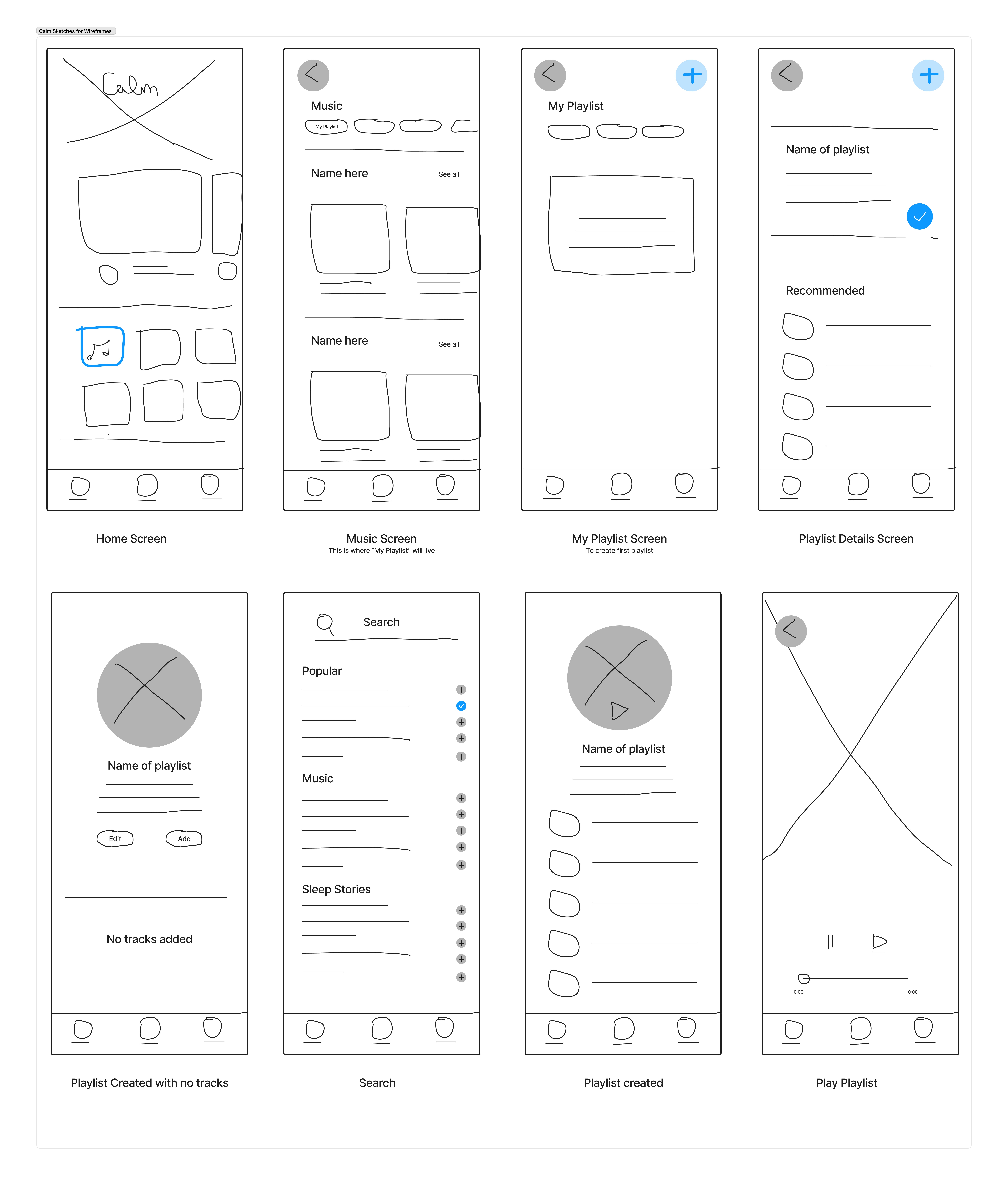
Wireframes
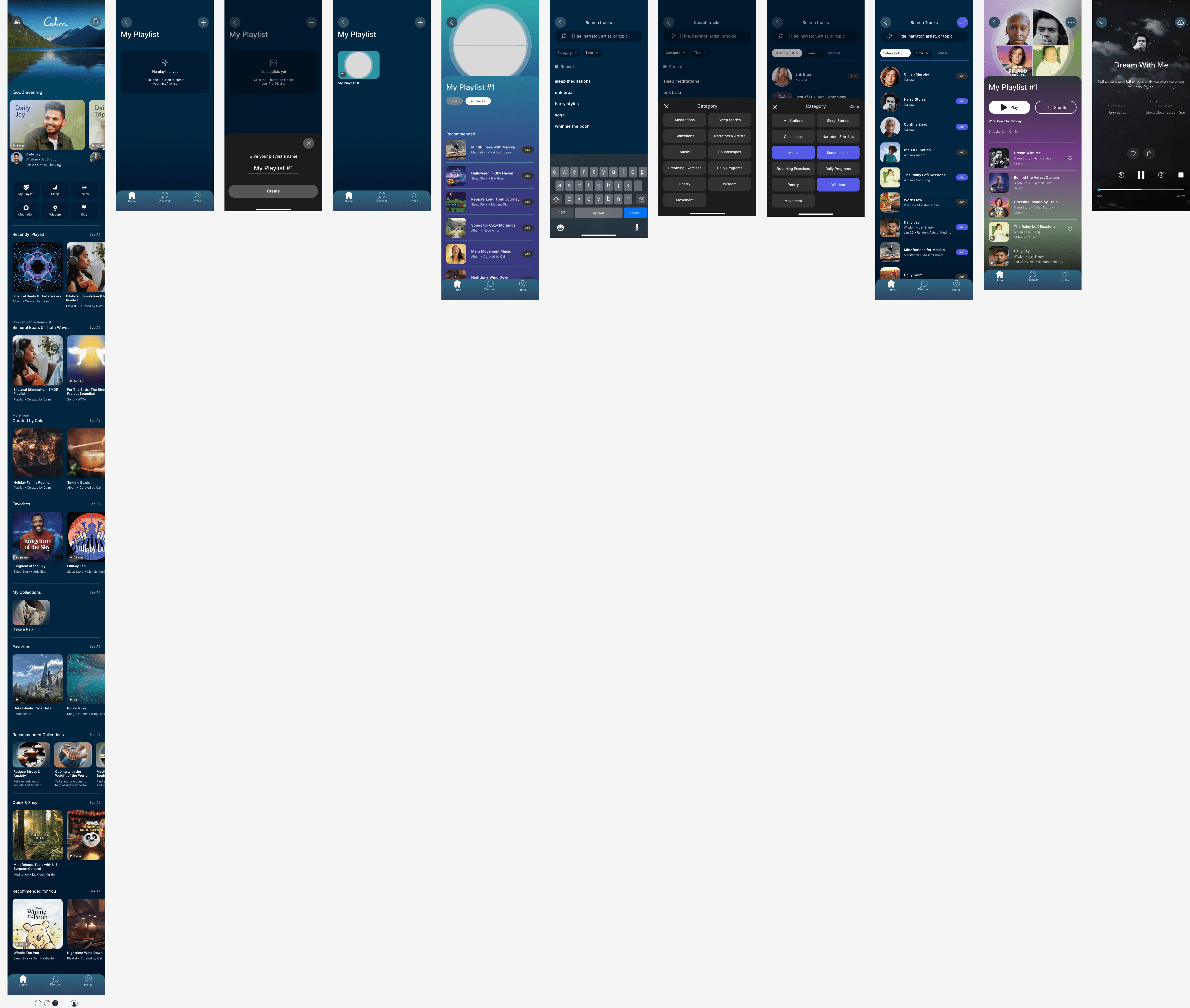
Using my pattern analysis research & task flow, I worked on the design flow of the feature. The idea is to have the playlist reside under the music section and that’s where the user would be able to find the playlist feature.
Mid-Hifi Wireframes
With Calm already having a defined brand and UI kit, I stayed mindful of the small details to mimic the look and feel as close as possible to seem credible.
Using a ton of screen captures from the Calm app on my phone, I used Photoshop to only crop out the images to use in the HiFi wireframes.
The trickiest part was making sure the transitions, buttons and placement followed Calm’s existing UI & flow.
Testing & Iterations
Prep for Testing
I conducted both in-person & remote user testing while recording their actions via computer.
Test Objectives
Uncover if there are design inconsistencies and usability problems
Test overall flow and ease of navigation
Test the proposed feature to see if credible
Learn about the user’s behaviors and preferences. Are there any points of confusion, difficulty, or hesitation?
Find opportunities to improve the design
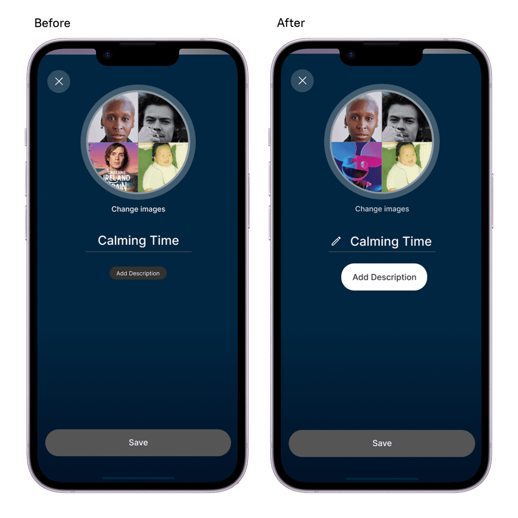
Test the options provided for creating a playlist and editing the playlist
Methodology
Conducting a virtual usability test using Zoom to record (with permission) participants. Will collect demographics, satisfaction assessment, and suggestions for improvements
Qualitative usability testing
Goal
Have participants complete the tasks without error or confusion. Evaluate participants' interactions to iterate any areas that were pain points. Get feedback on the overall design and flow of the feature.
Educational Onboarding
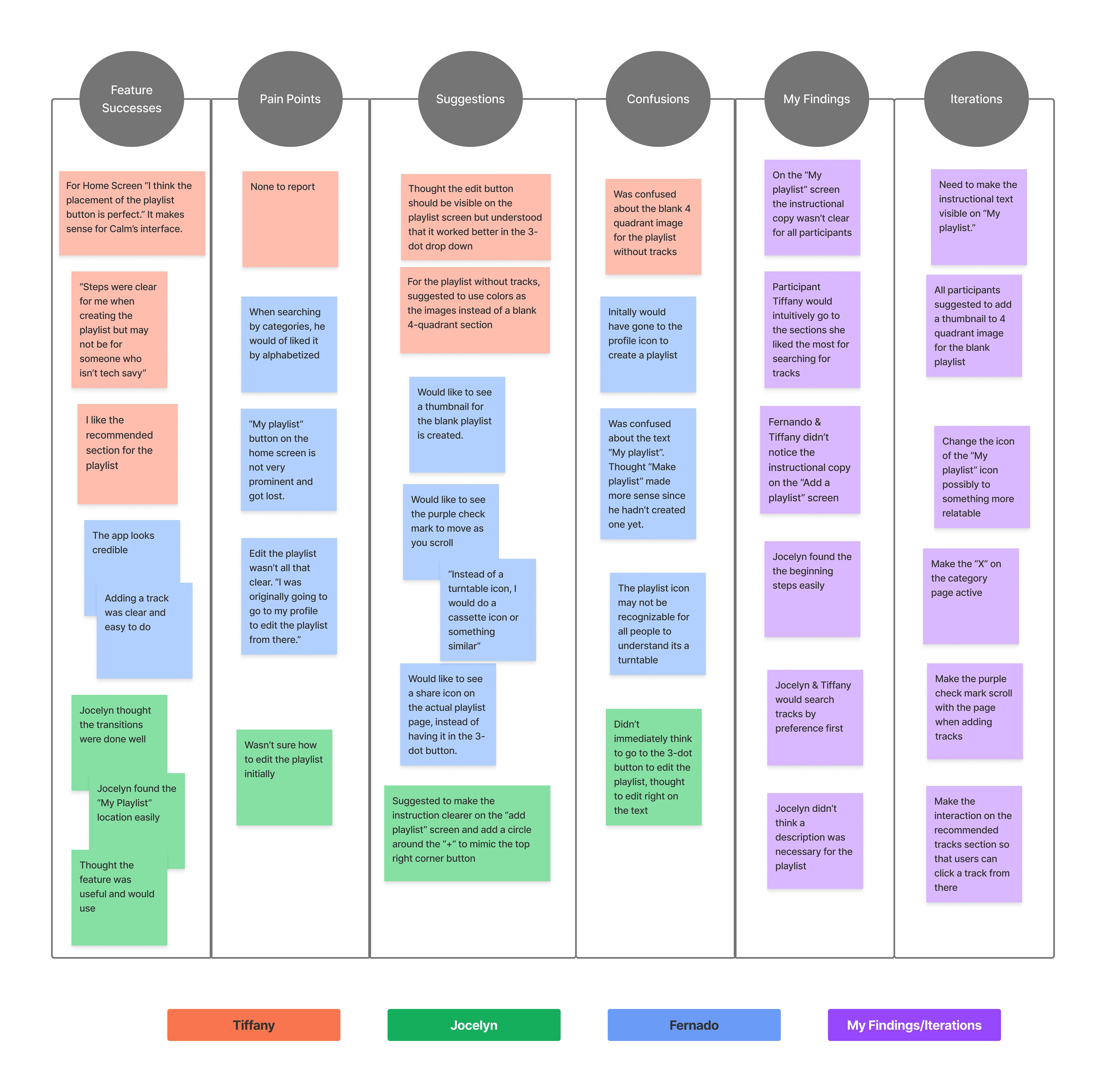
After conducting my usability tests, I created an affinity map with key insights, behaviors, and findings during the tests.
100% of participants completed the proposed tasks. All participants commented on the credibility and professional look, complimenting the seamless transitions.
Key insights:
For Home Screen “Instead of a turntable icon, I would do a cassette icon or something similar”
All participants didn’t notice the instructional copy on the “Add a playlist” screen
The purple check mark should scroll with the page when adding tracks
Successes
"For Home Screen “I think the placement of the playlist button is perfect. It makes sense for Calm’s interface."
Pain Points
"I was confused about the text 'My playlist'. I think 'Make playlist' makes more sense since I haven't created one yet.
Improvements
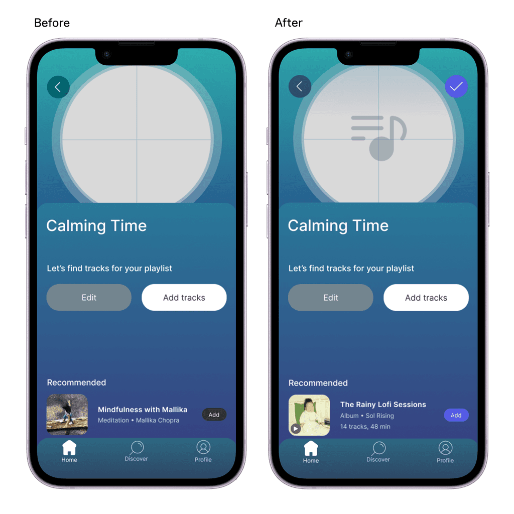
All participants suggested to add a thumbnail to 4 quadrant image for the blank playlist.
Insights
Revised Prototype
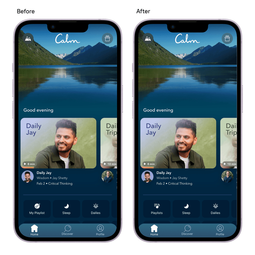
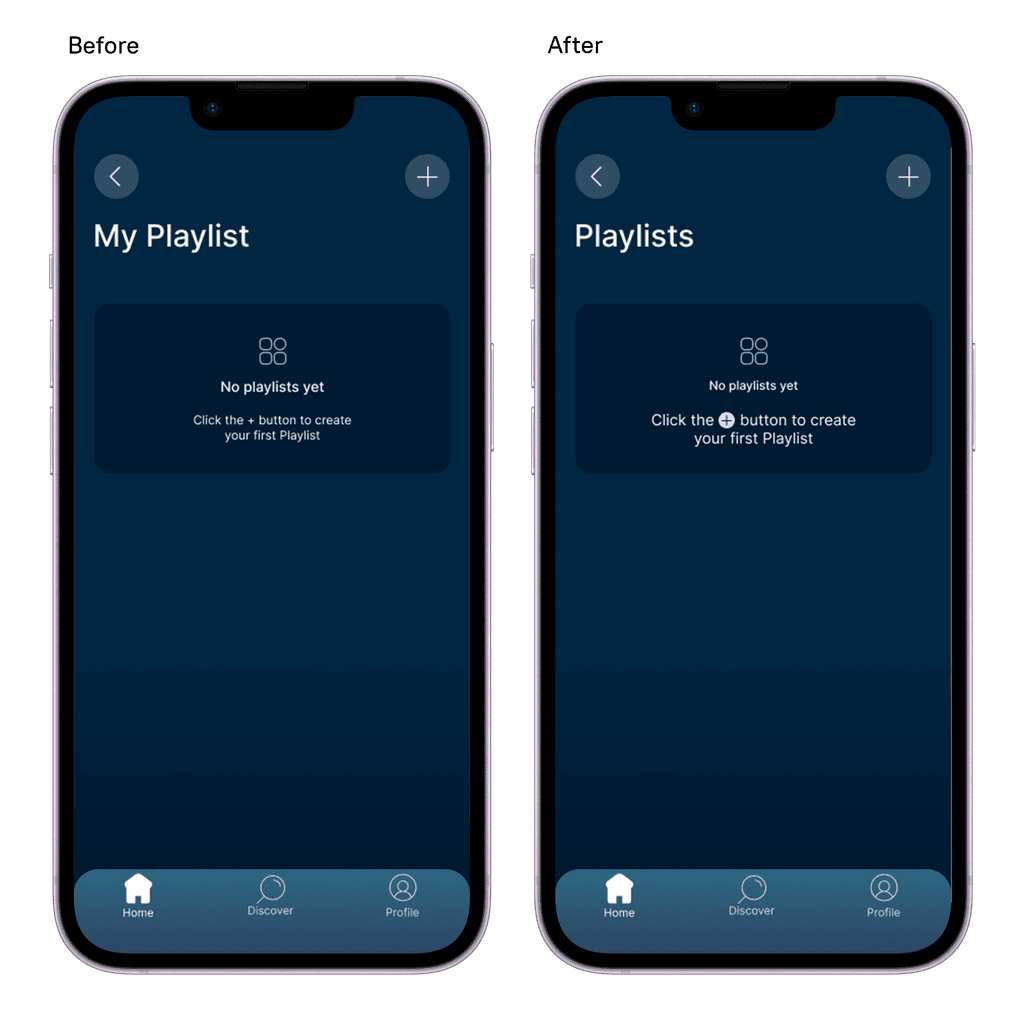
Based on observing users interacting with the prototype and the feedback I received, I prioritized these key changes:
Changing the playlist icon
The instructional information on how to create a playlist needed to be clearer
For adding tracks, have the purple check mark stay in a fixed position when scrolling
Adding in a thumbnail for the blank playlist

