TIMELINE
6 weeks
PLATFORM
Responsive Desktop
Brand Identity
TOOLS
Figma
Zoom
Dovetail
Optimal Sort
Adobe Illustrator
Adobe Photoshop
MY ROLE
Research
UX/UI Design
Branding & Visual Design
Prototyping
Usability Testing
The Brief
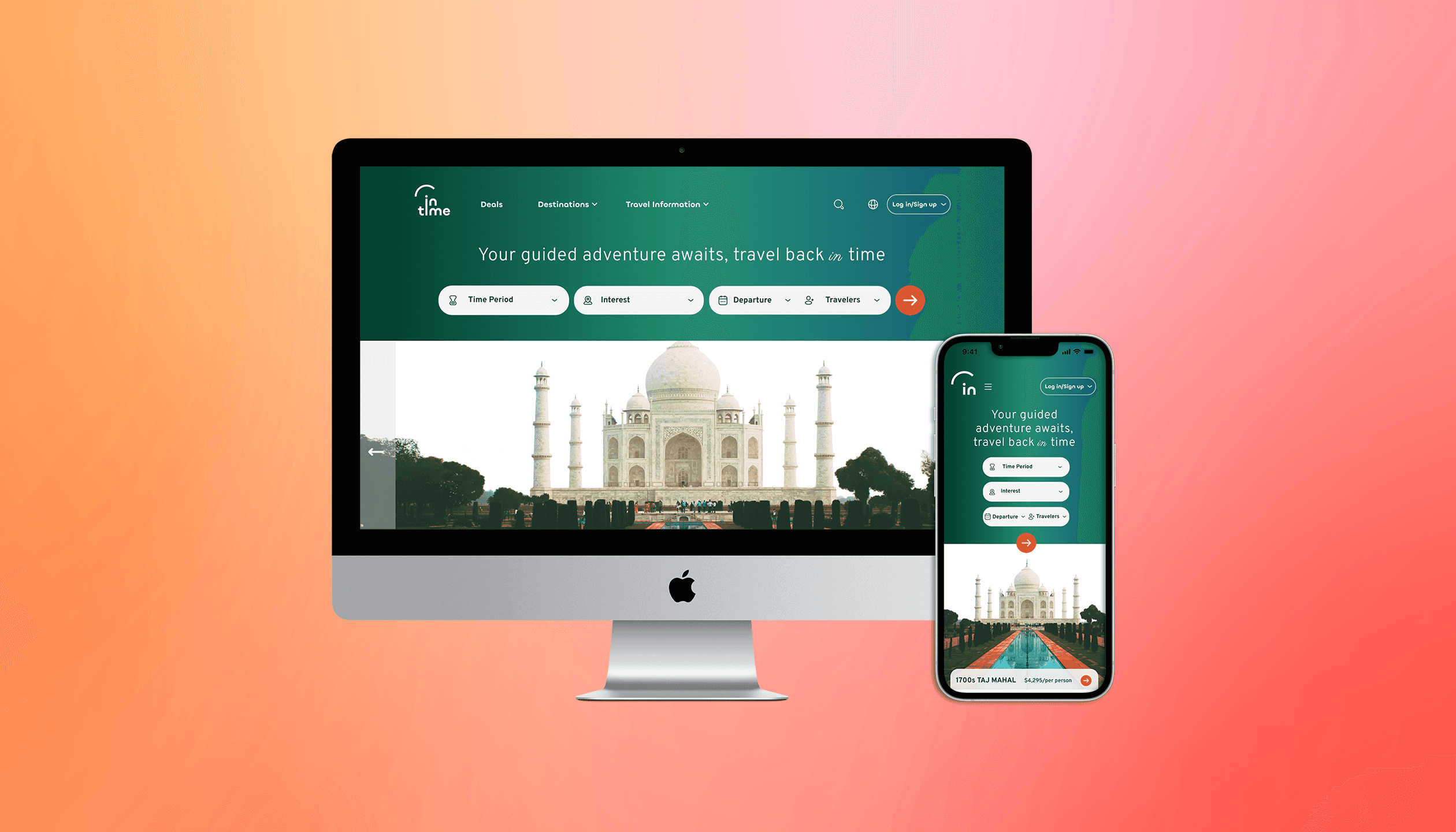
New to market time travel tourism, InTime has limited destinations all over the world--from prehistoric times through today. InTime wants to highlight what’s special about each time and space, and how to classify or categorize trips to make it easier for people to find the one that they like best.
Click to view Final Prototype
Scope of Work
InTime is looking to design their new brand and set up an e-commerce responsive website so they can sell travel packages and tickets at different times
Goal
Design a logo for the company that can be modern and historical
Design a responsive e-commerce website that is easy to use and allows customers to browse different trip categories and details, filtering depending on interests and classifications
Measuring Success
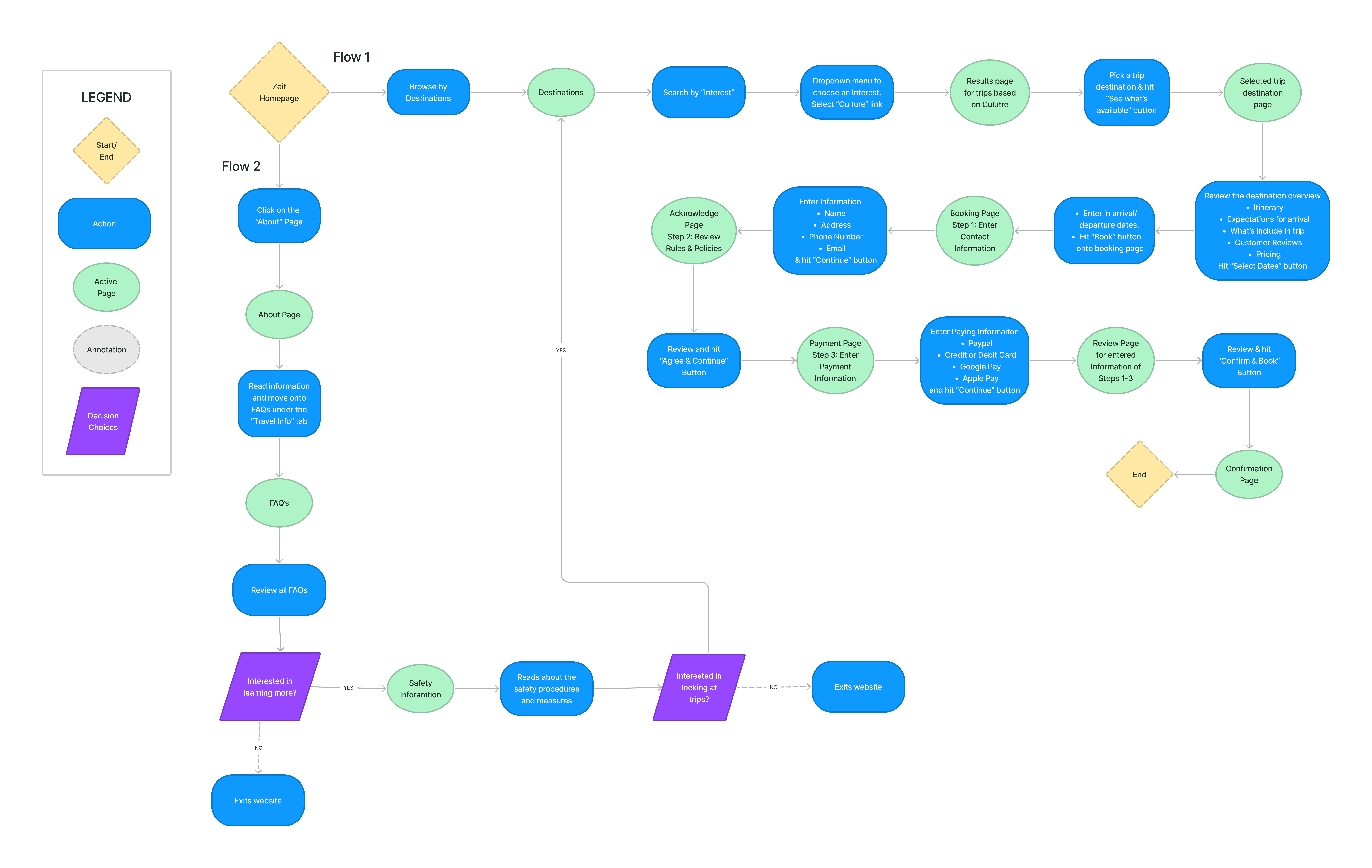
The customer is able to successfully navigate site in finding all relevant materials
Successfully book a trip
Improve customers perception about time travel
Research & Analysis
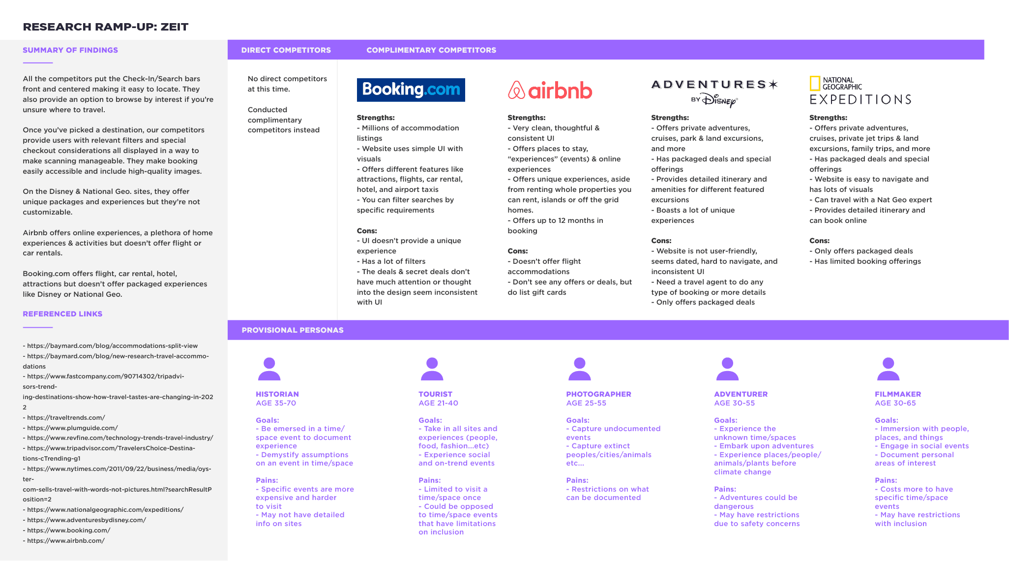
Competitive Analysis
(click image to enlarge)
All the competitors put the Check-In/Search bars front and centered making it easy to locate. They also provide an option to browse by interest if you’re unsure where to travel.
On the Disney & National Geo. sites, they offer unique packages and experiences but they’re not customizable.
Airbnb offers online experiences, a plethora of home experiences & activities but doesn’t offer flight or car rentals.
Booking.com offers flight, car rental, hotel, attractions but doesn’t offer packaged experiences like Disney or National Geo.
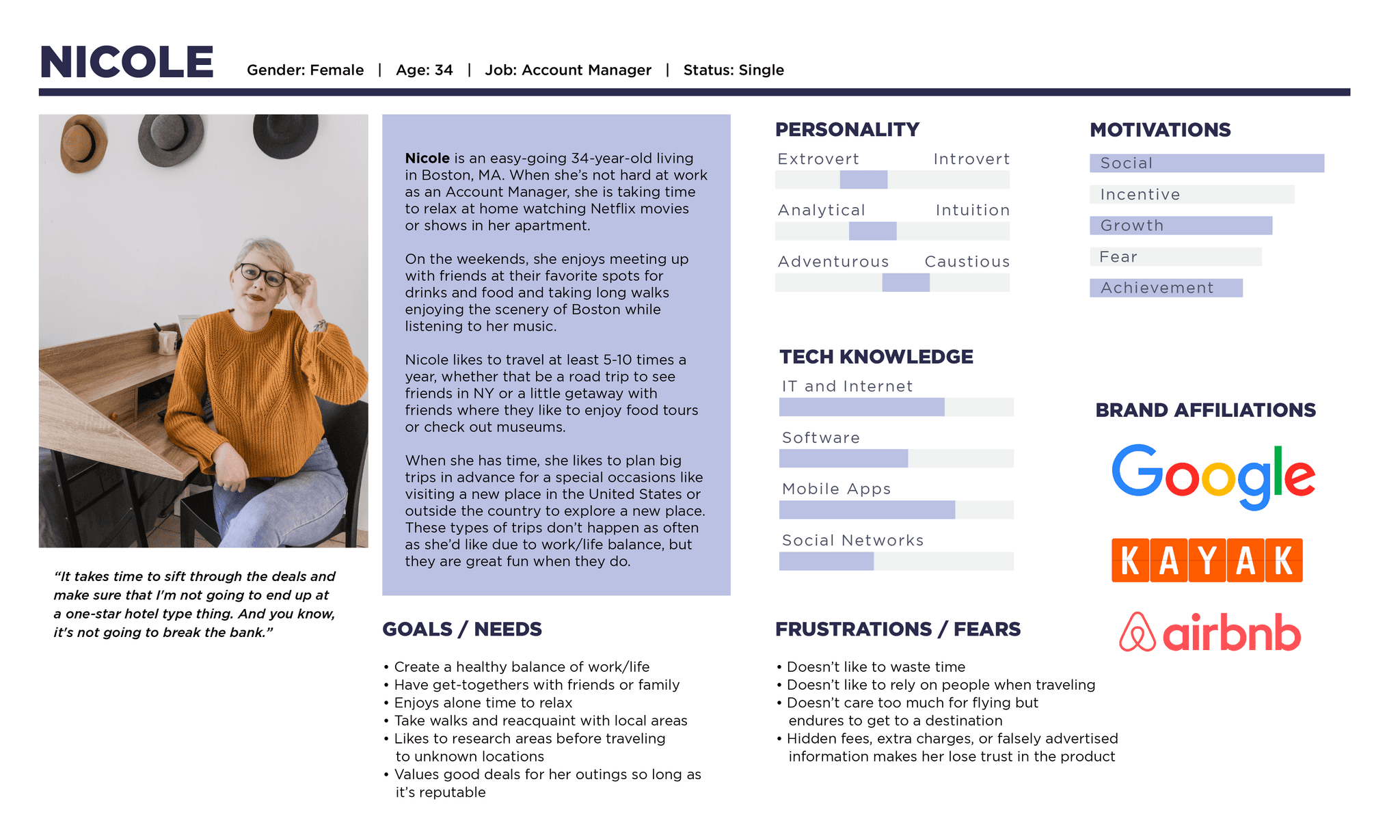
Defining the Personas
(click below image for full persona)
My user persona is based on the interviews I conducted and pulled the commonalities I found. Meet Nicole, a conscientious adventurer.
All participants had a set collection of sites they used for booking their travels
Affordable booking options when deciding which booking tool to use is highly valued
Experiencing new places and cultures were motivations to travel to sites unknown
All participants expressed they would travel to historical sites
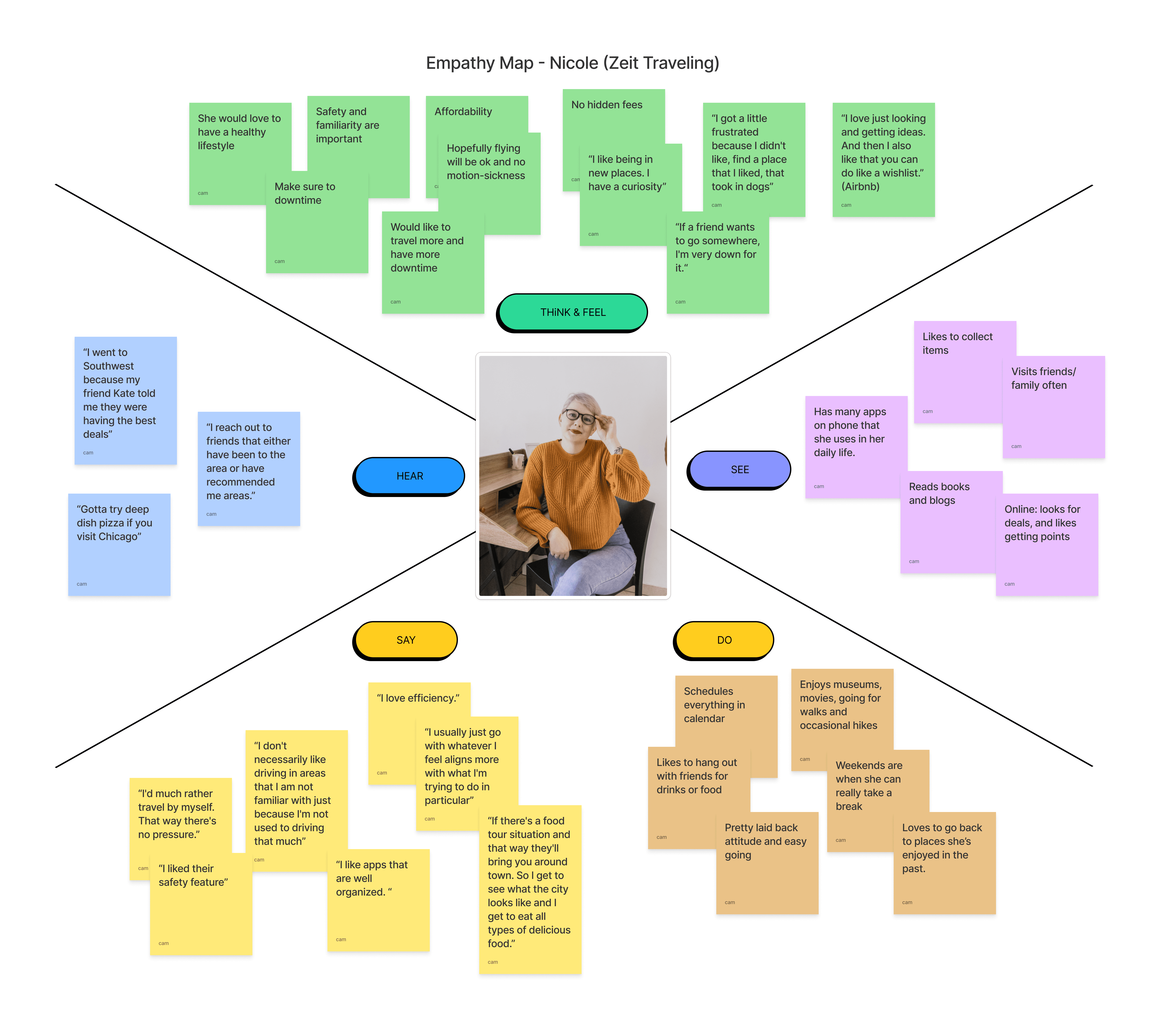
Empathy Map
(click to view)
Information Architecture
Card Sorting
To gain insights into information architecture, I conducted an open card sort to understand how users organize content into categories done via Optimal Workshop.
Out of the 20 items, I found that many of the participants had a varying amount of categories, from 2 categories to 8. Some had similar wording for their categories, like “Human Achievements” and “Innovative moments in history” which allowed me to deduce commonalities.
Site Map
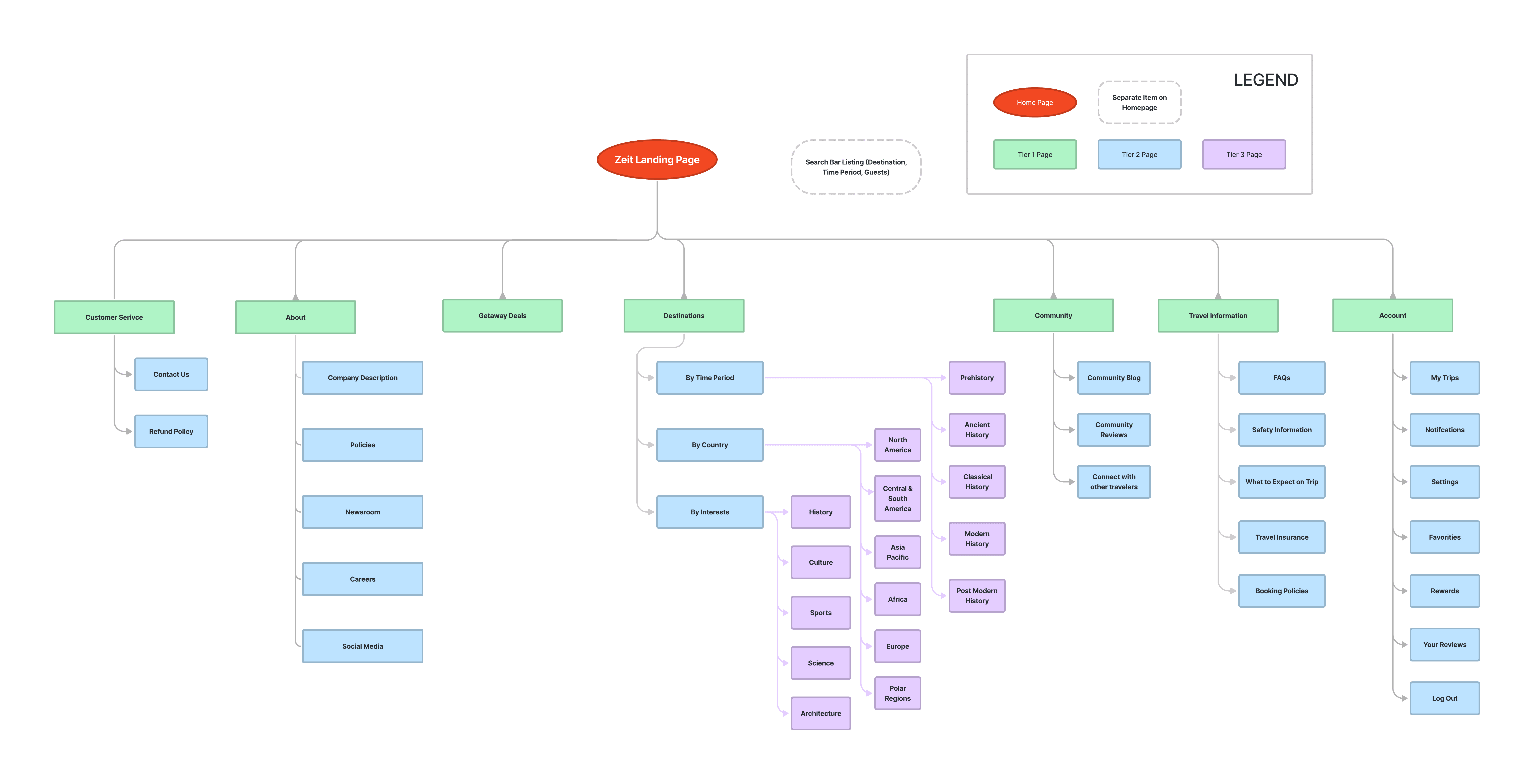
Based on the information from my card sorting, user persona, and competitive research I created the site map.
Wireframes
Platforms
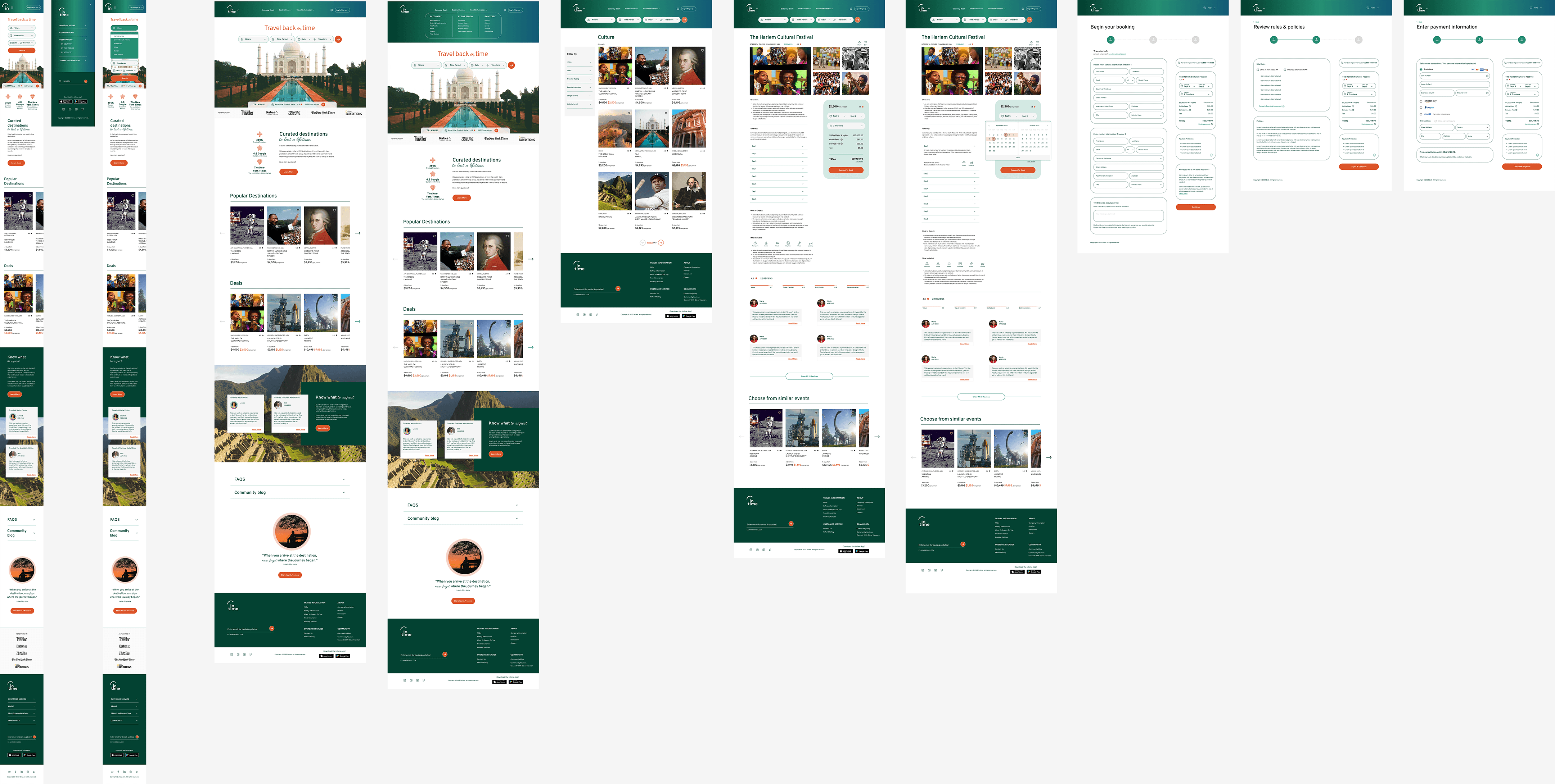
Taking into account my research, interviews and all the gathered information I created my lofi & hifi-level wireframe for a responsive homepage for the desktop and mobile.
Hifi
Conceptualizing the Brand
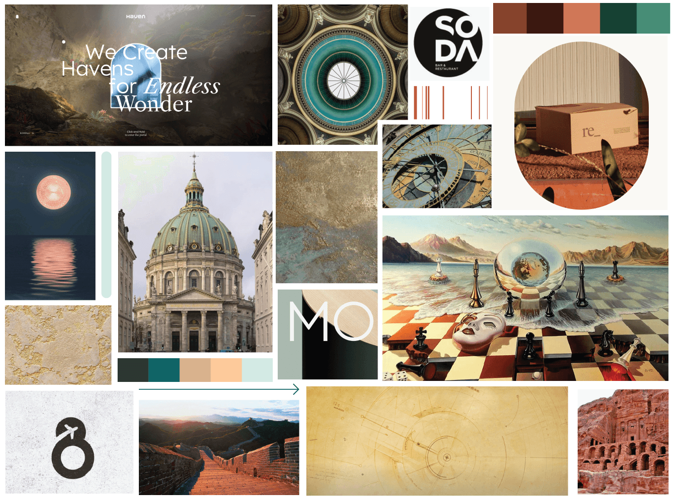
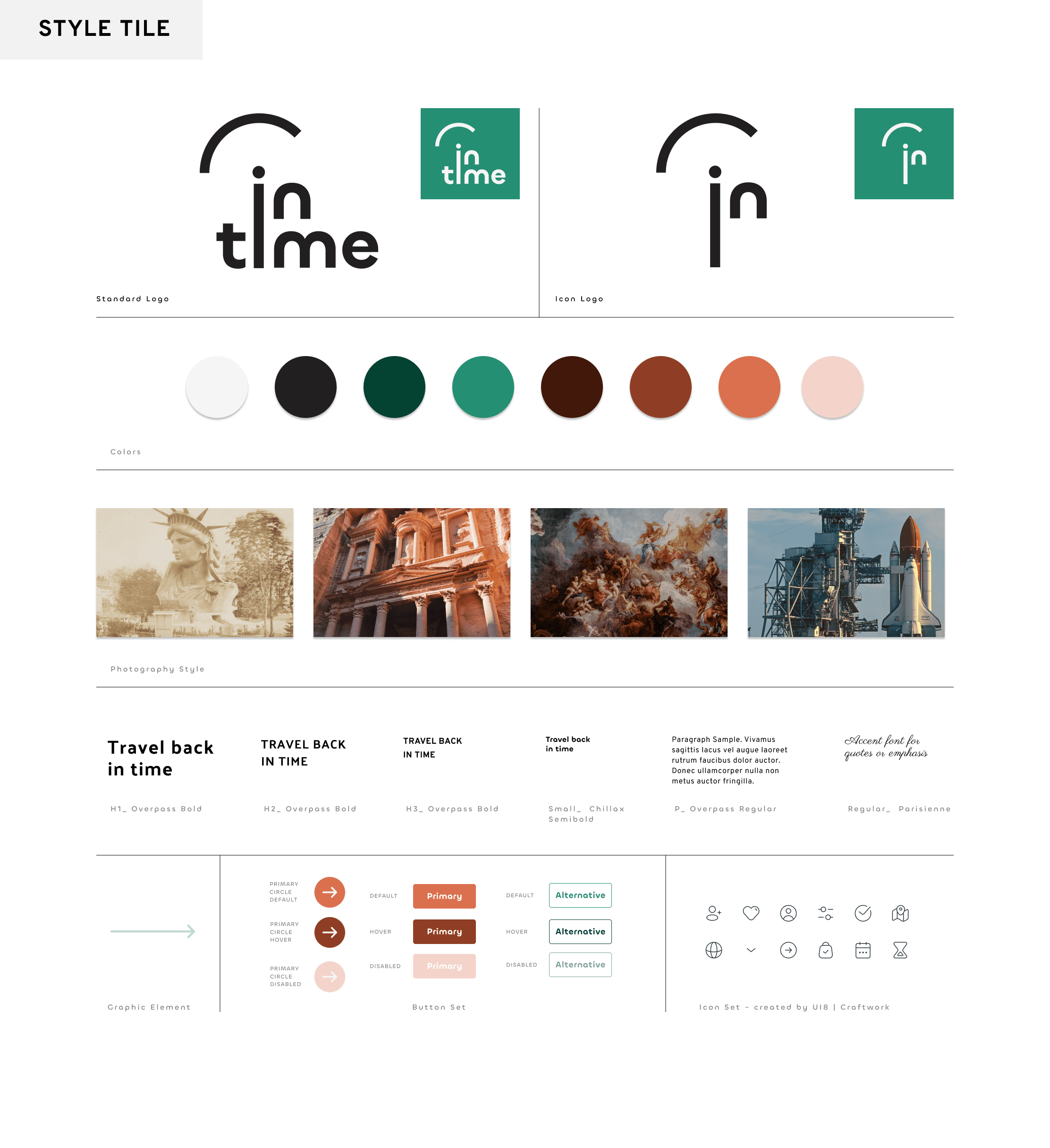
InTime takes a modern, fresh approach in layout, logo and graphics package. The color palette chosen are bright earth tones, accompanied by (2) sans-serif fonts with an accent script font.
Testing & Iterations
Educational Onboarding
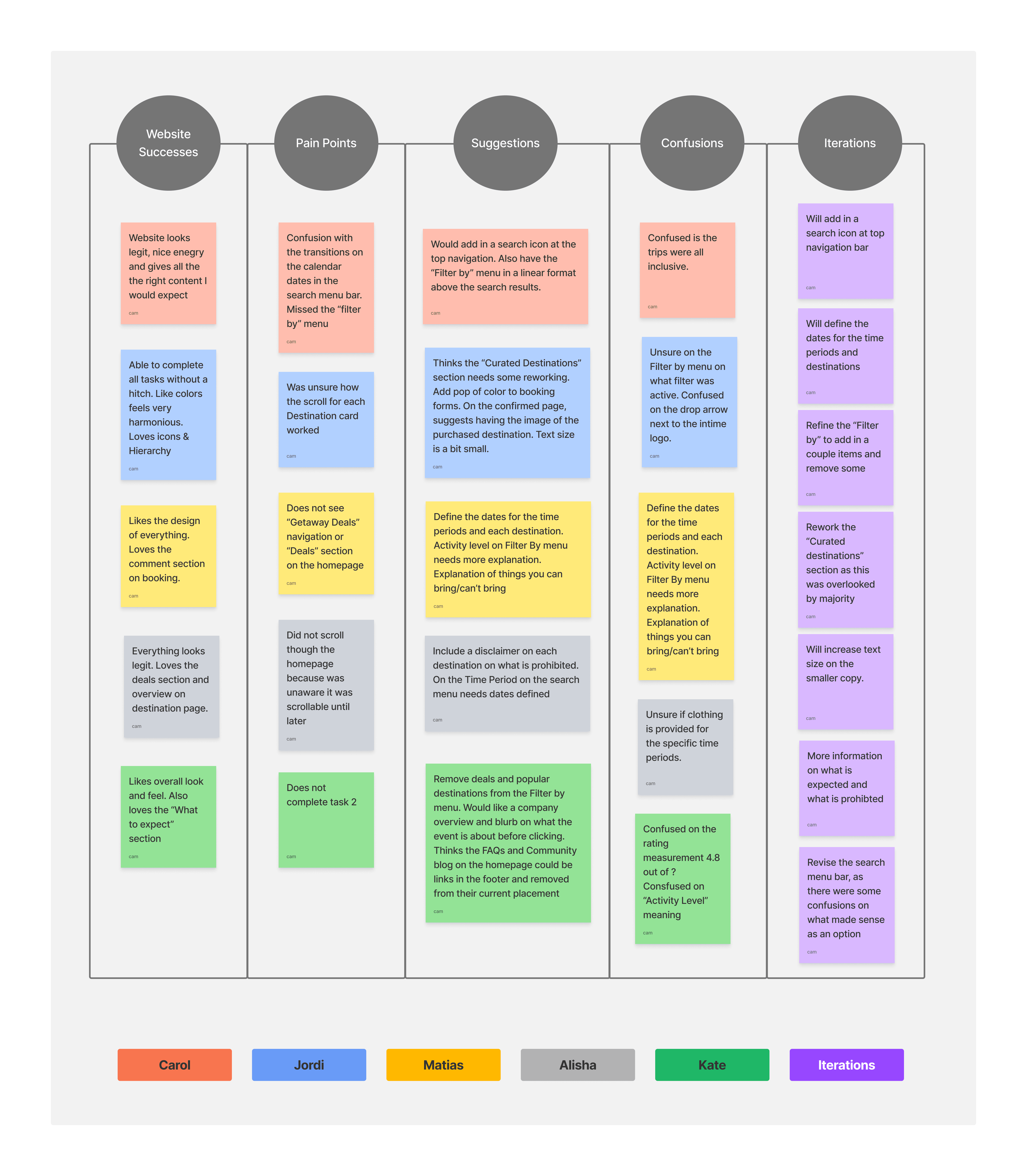
From my interviews, I broke down some of the main points that were echoed by several of the users.
Successes
All participants like the visual look and color scheme of the website and thought it “looks legit”
Pain Points
Dates need to be included on all the destinations and the Time Period, as many people weren’t sure on the dates of some of the periods.
Improvements
Rework the “Curated destinations” section as this was overlooked by majority
Insights
Revised Prototype
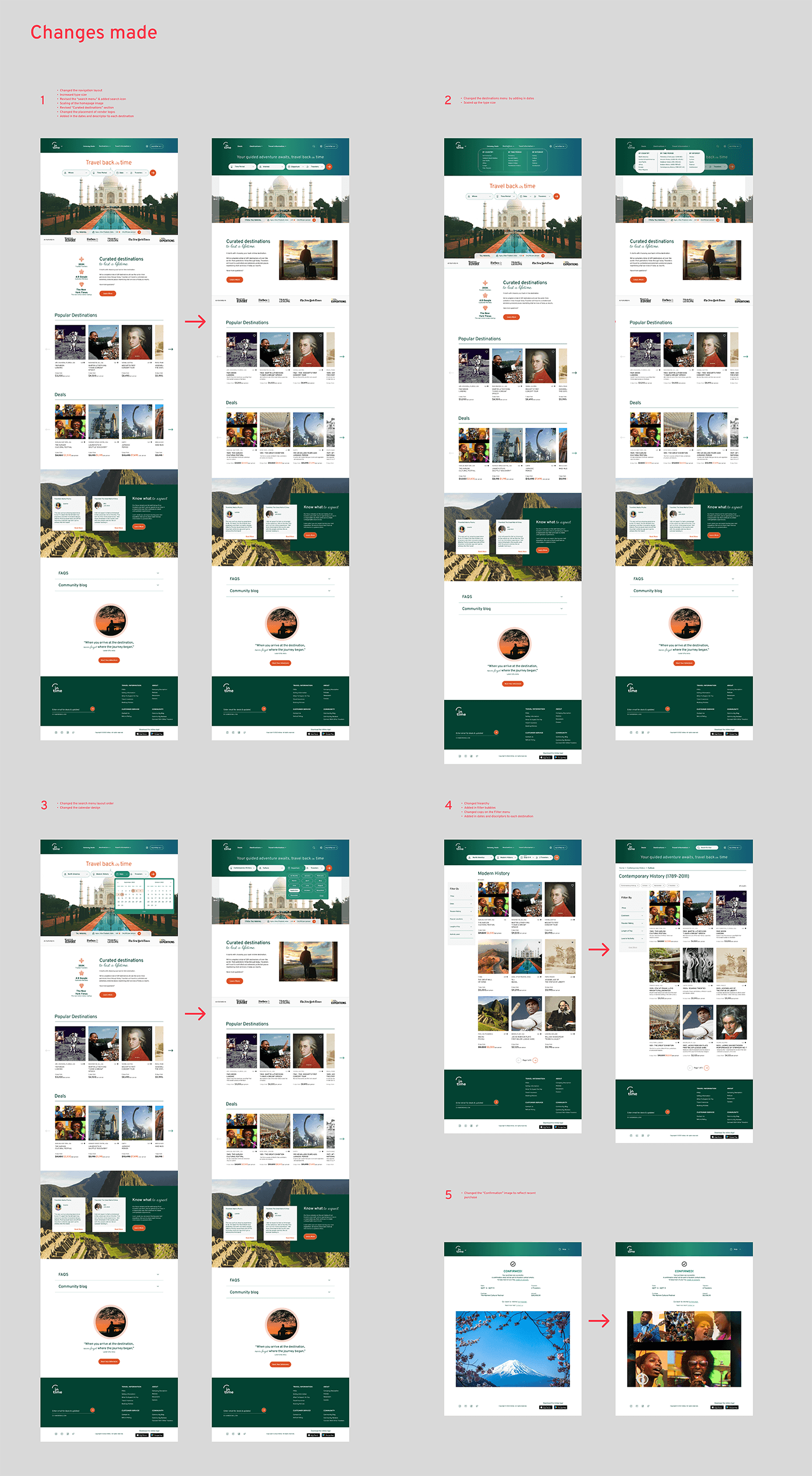
Based on my insights on testing my first prototype, I flushed out some of the main issues users found.
Takeaways:
As the sole designer on this project, some takeaways:
There’s more to be said in designing for practicality and less for aesthetics
Test your ideas early and question if your design choices add or take away value
While interviewing give a little extra time for banter and extra information the users provides

