TIMELINE
5 weeks
PLATFORM
Responsive Website
TOOLS
Figma
Zoom
Framer
Google Forms
Adobe Illustrator
Adobe Photoshop
MY ROLE
Research
UX/UI Design
Branding & Visual Design
Prototyping
Usability Testing
The Brief
A Path to Wellness is a local primary care holistic medicine practice focused on the underlying root cause, located in St. Petersburg, FL. Using natural medicine, functional medicine, and integrative medicine they address a wide range of chronic health concerns in children and adults.
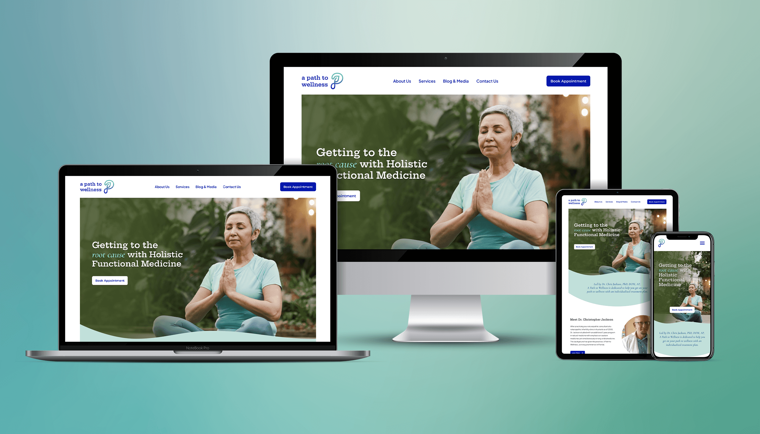
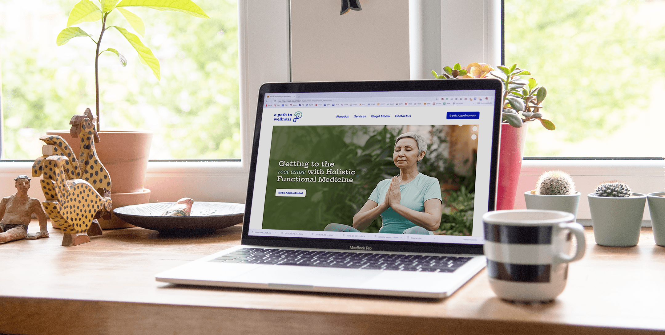
I redesigned the brand identity and designed a responsive website.
Click to view Final Prototype
Scope of Work
Currently, the website is cluttered and lacks any true brand identity and visual hierarchy.
It’ll be my job to redesign the website to address the areas mentioned above and make the website feel current, communicate clear messaging and be user-friendly from desktop to mobile.
Goal
The ultimate goal of this project is to increase clientele for A Path to Wellness.
The focus will be on the redesign of the website to make it responsive as well as elevate its brand identity so potential patients have a sense of confidence and trust in their capabilities.
Measuring Success
The customer is able to successfully navigate site in finding all relevant materials
Increase clientele
Improved customer’s perception of A Path to Wellness
Research & Analysis
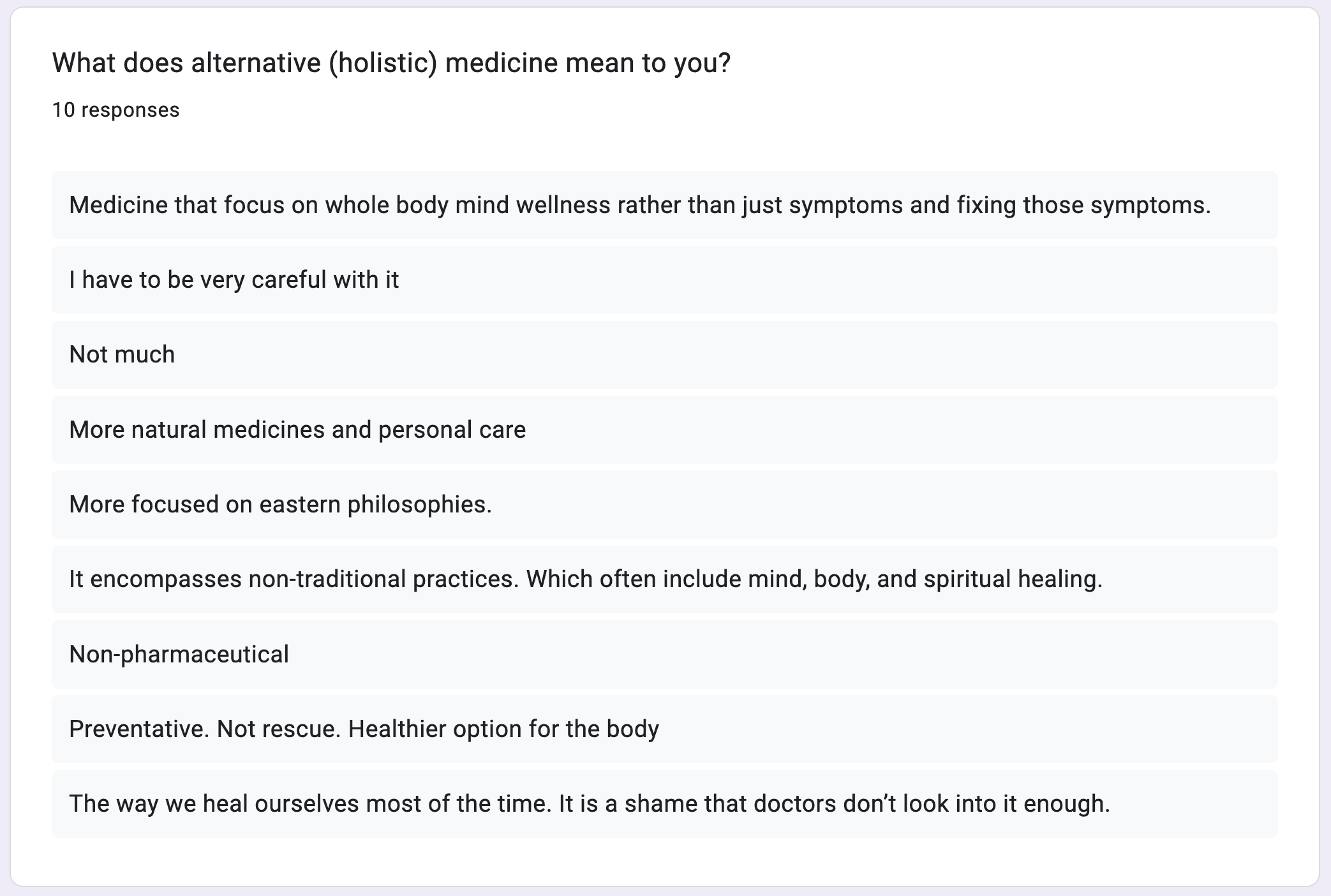
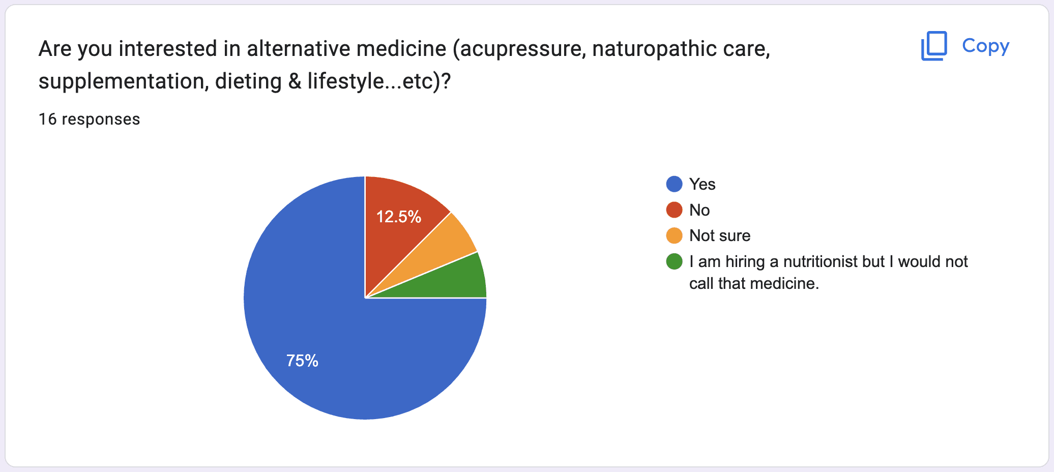
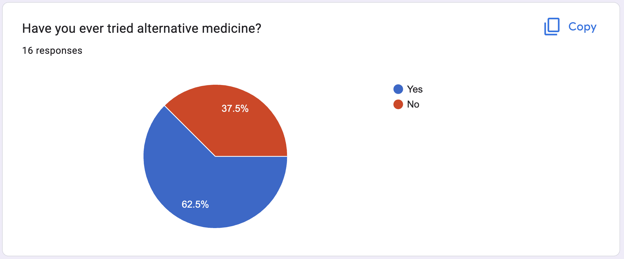
User Survey & Insights
From the survey, my goal was to find out:
How people defined alternative medicine
Were there any personal experiences with it
Was there an interest in trying it out for practical prevention or primary care
Defining the Personas
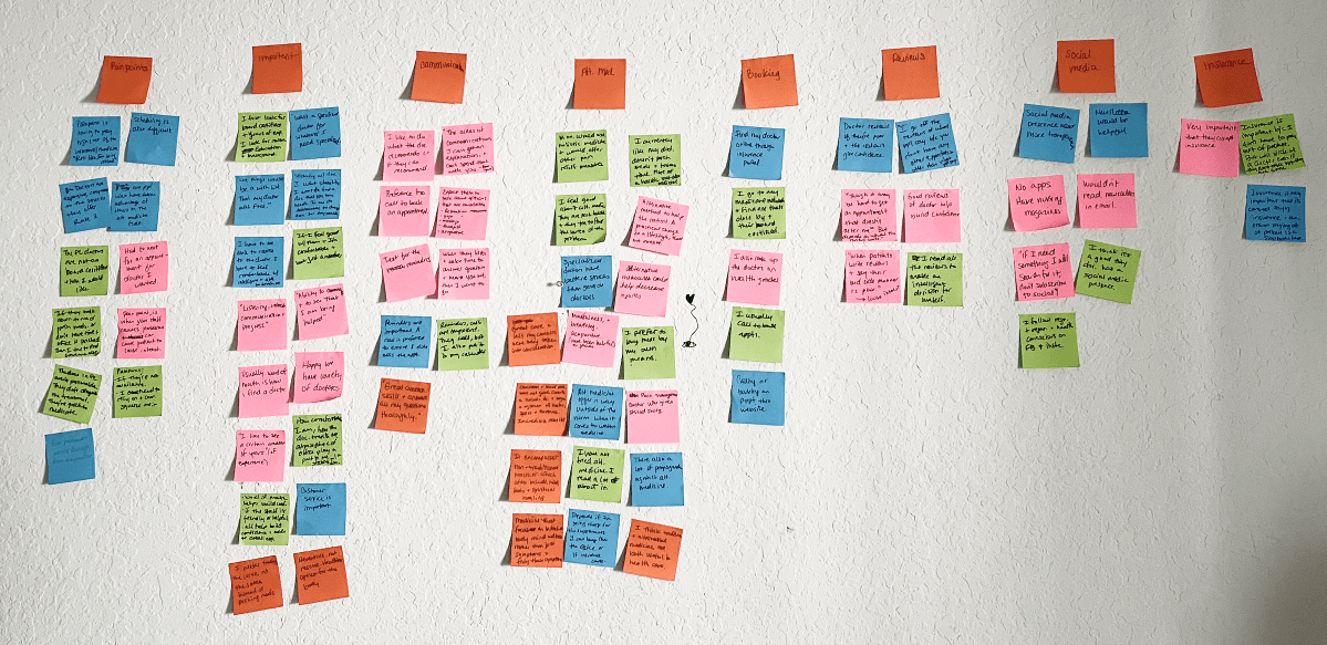
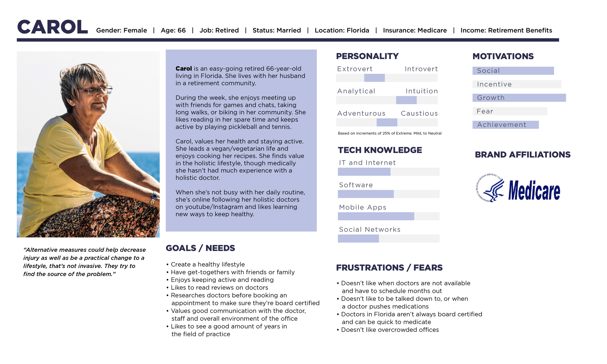
The goal was to determine our audience of who would be interested in alternative medicine, what they valued in doctors and what criteria they found important. There were distinct patterns that I uncovered which I synthesized into an affinity map.
Values good communication with the doctor, staff and overall environment of the office
Researches doctors before booking an appointment to make sure they’re board certified
Doesn’t like when doctors are not available and have to schedule months out
Reviews are important
Mapping Out the Flow & Branding
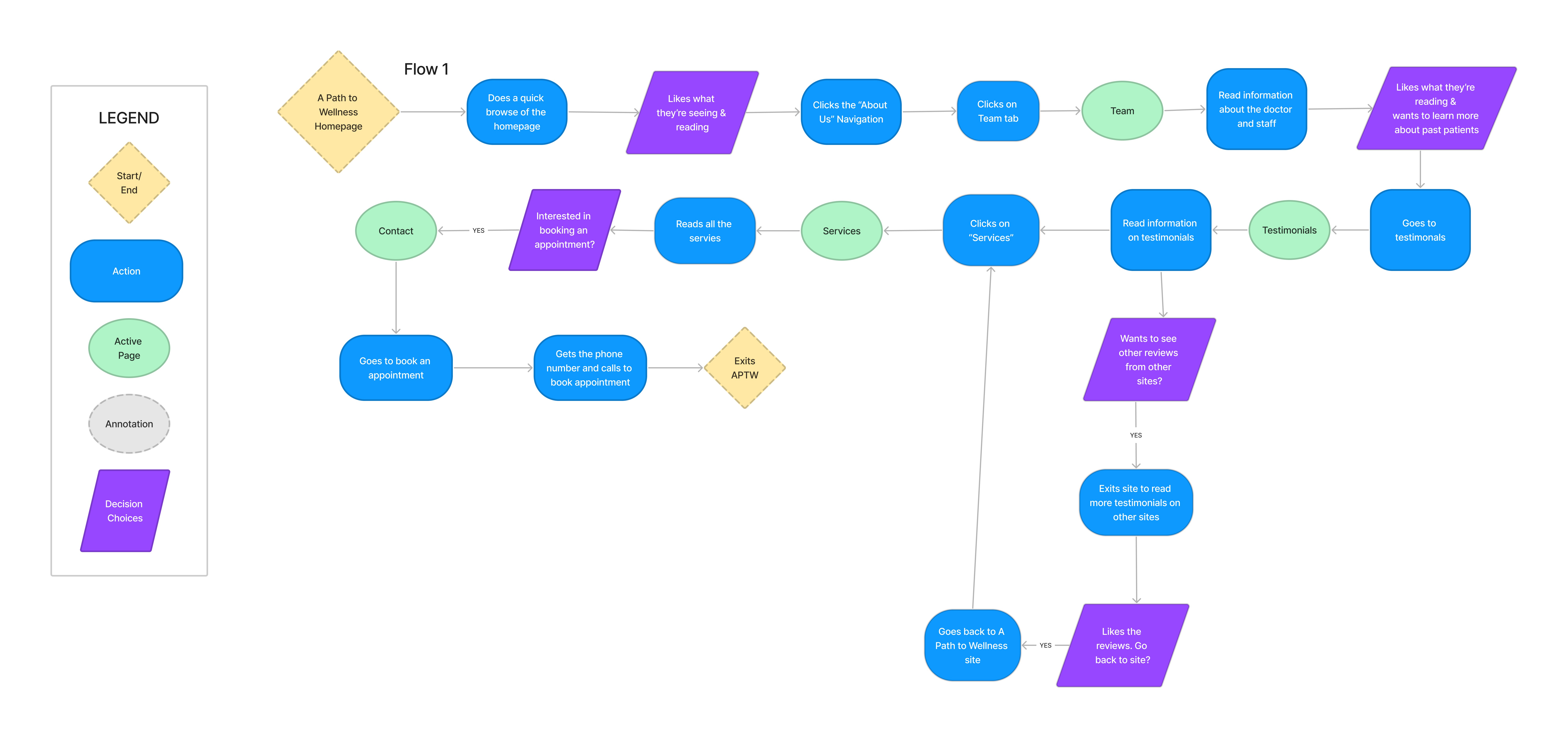
User Flow
My user flow focused on the user being a new customer to the site. What would they find important to view? Which sections would be their first choices? I designed the flow to start with information about the practice and then eventually make their way to booking an appointment.
Conceptualize the Rebrand
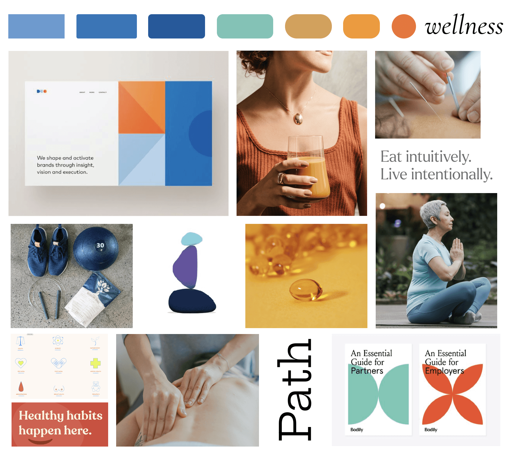
With this rebrand, I started thinking of who my audience will be and what message I wanted to convey when a person enters the site.
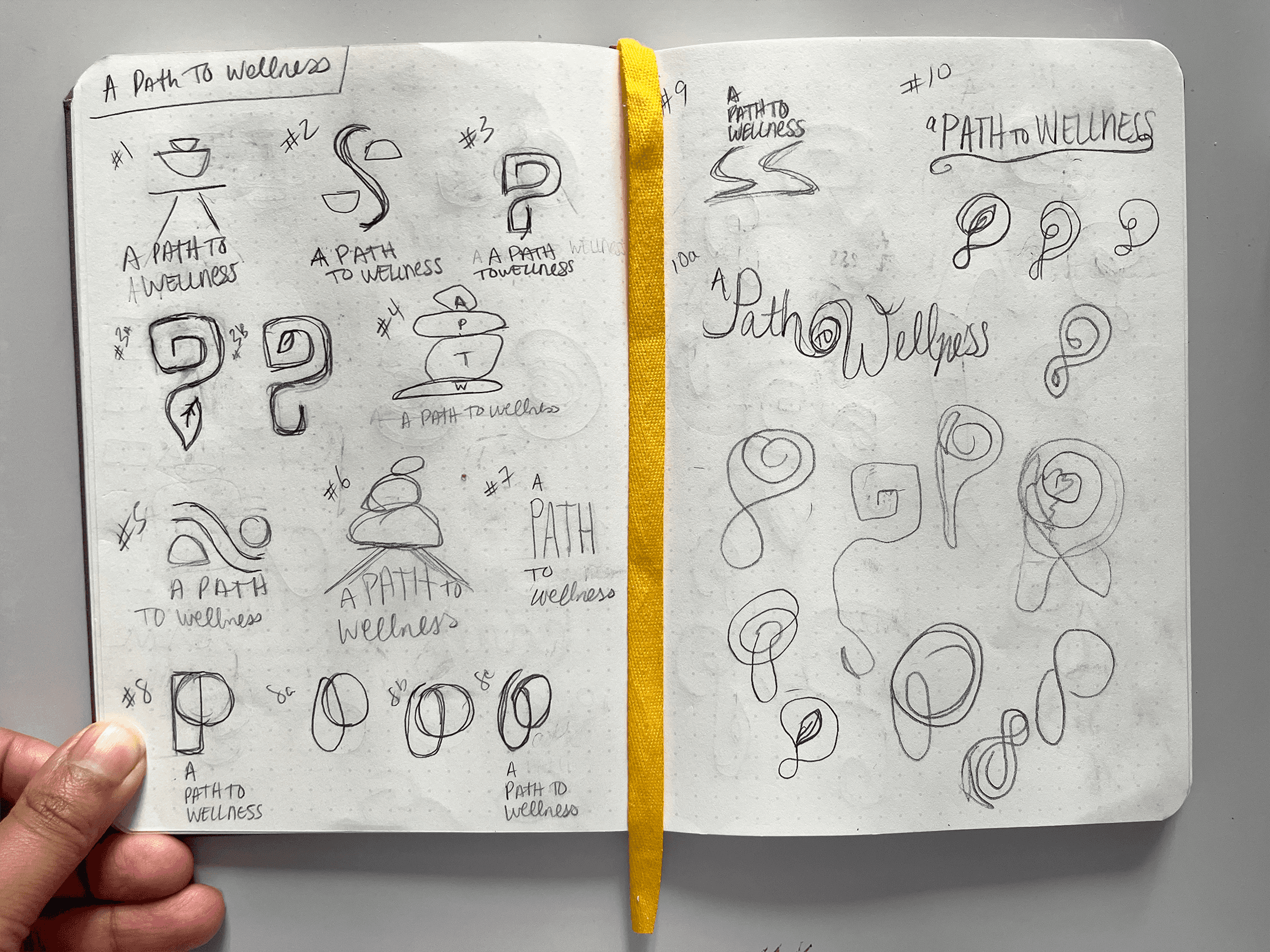
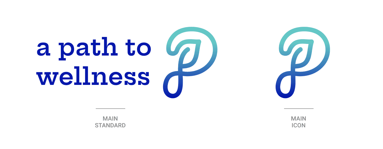
Cool tones of blue came to mind, to bring a sense of trust and then hues of orange to bring in warmth. The imagery would be simplistic and nod to natural wellness. For the logo, I sketched ideas relating to a continuous line (like a path) with a hidden leaf in the “P” to denote a natural element.
Wireframes
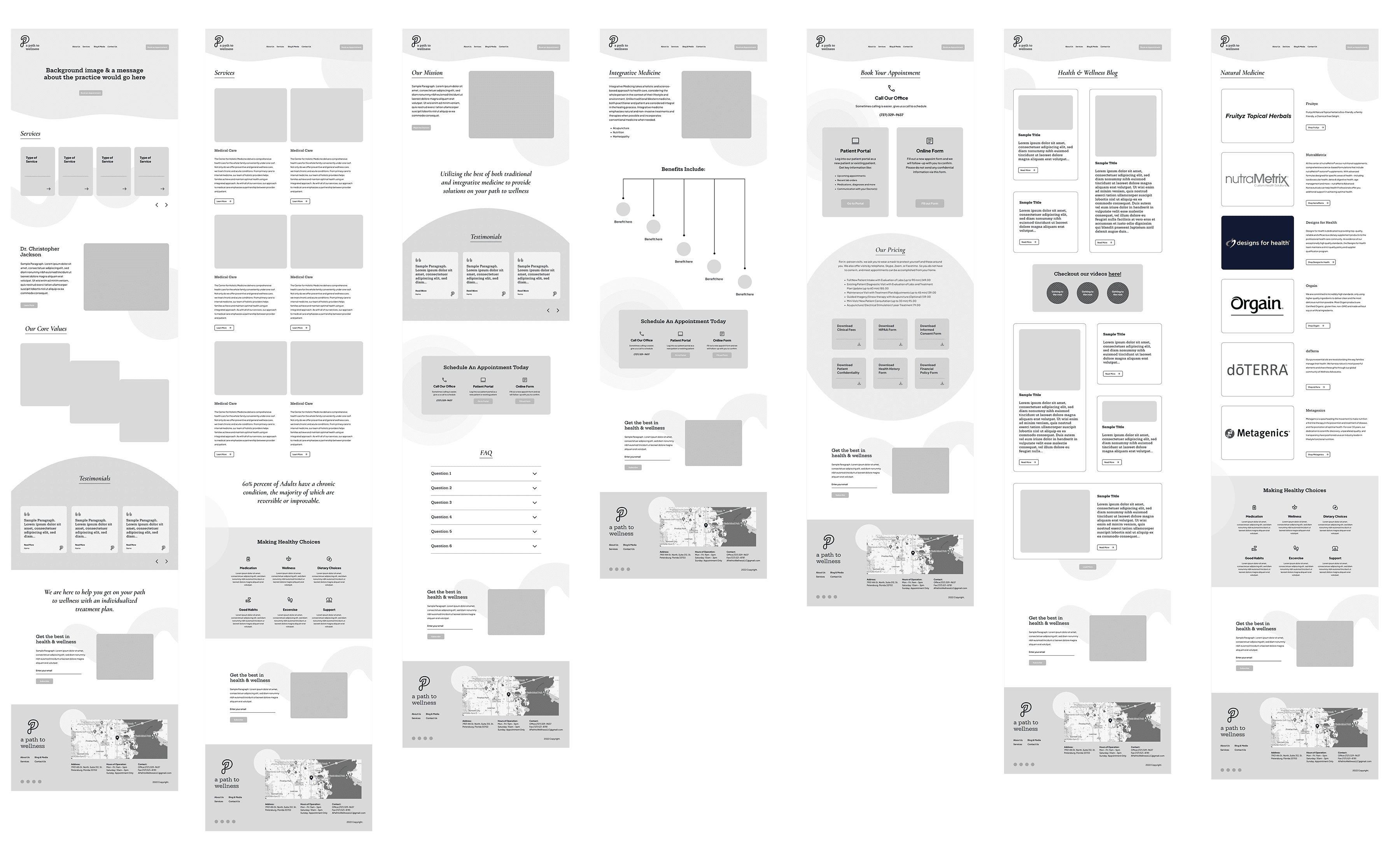
Lofi Wireframes
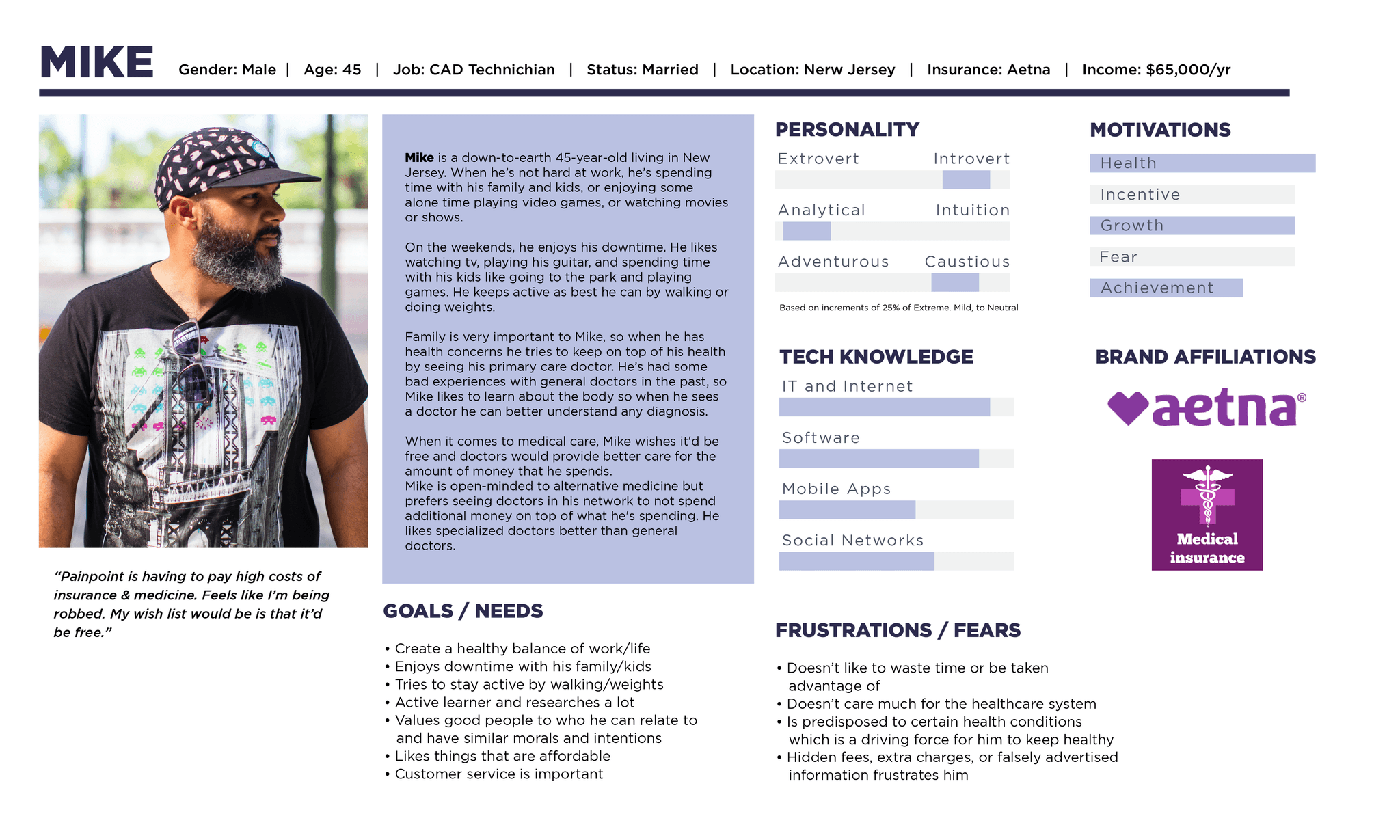
Between my two personas, I had to keep in mind the important needs they share when building the responsive site. How might we make the site look and feel credible to attract more customers?
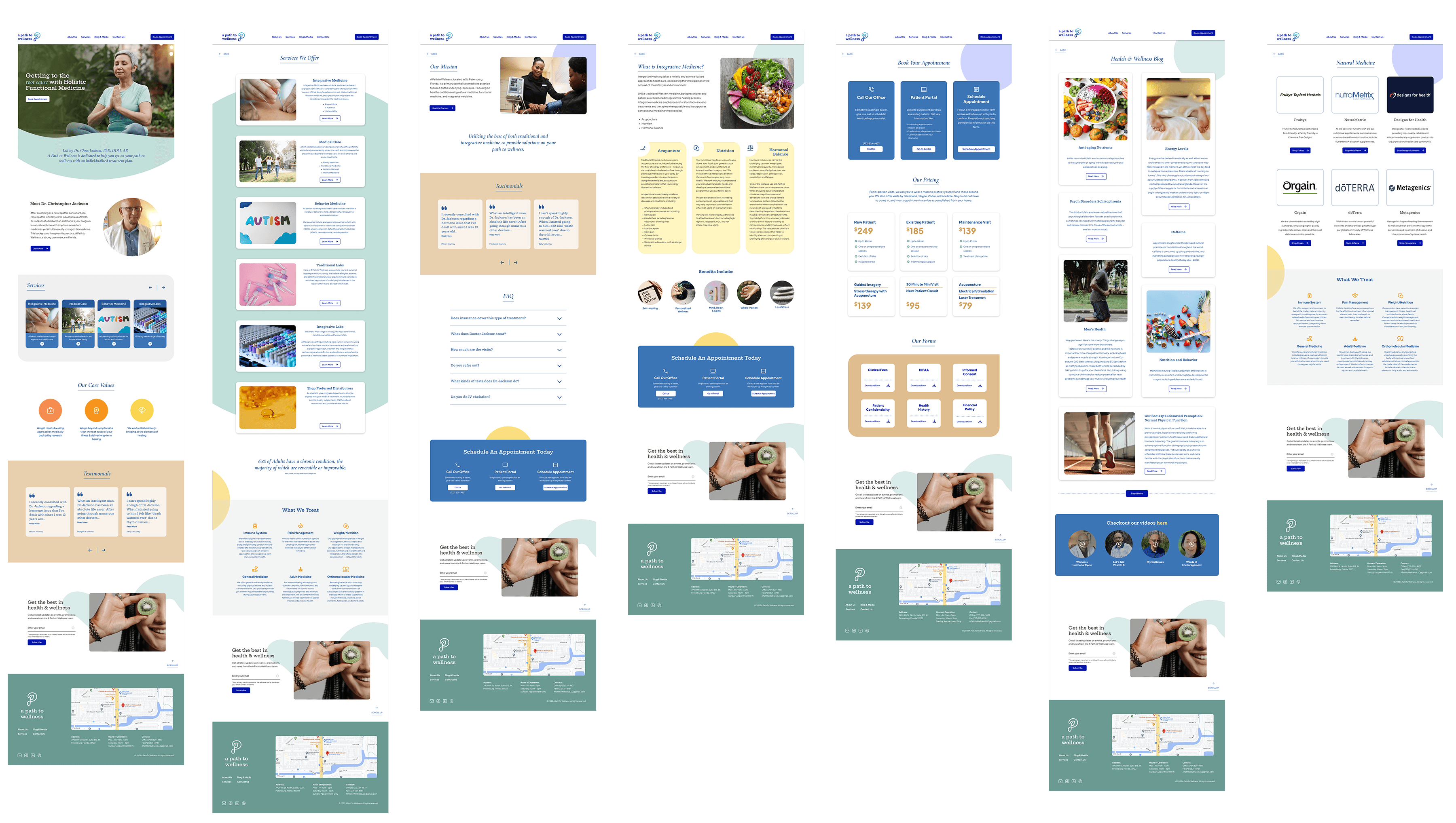
I started with sketches and worked my way into wireframes. For the redesign, I kept mindful of creating a sense of ease by directing the eye with rounded shapes & graphic elements for interest. I designed the beginning layouts to get feedback from peers and my mentor. Once iterations were made I was ready to test it with previous interviewees.
With each iteration there were improvements made. From the changing of colors, reducing of clutter, creating a more simplistic layout and providing clearer information.
Desktop
Final HiFi Wireframes
Desktop
Testing & Iterations
Usability Testing
Objective
Uncover if there are design inconsistencies and usability problems
Test overall flow and ease of navigation
Test the site’s credibility according to the participant; features they find valuable
Learn about the user’s behaviors and preferences. Are there any points of confusion, difficulty, or hesitation?
Find opportunities to improve design
Test the services offered and booking an appointment process
Methodology
Conducting an in person usability test using Zoom to record (with permission) participants. Will collect demographics, satisfaction assessment, and suggestions for improvements
Qualitative usability testing
Goal
Have participants' see if the overall design is trustworthy & valued enough to book an appointment
Educational Onboarding
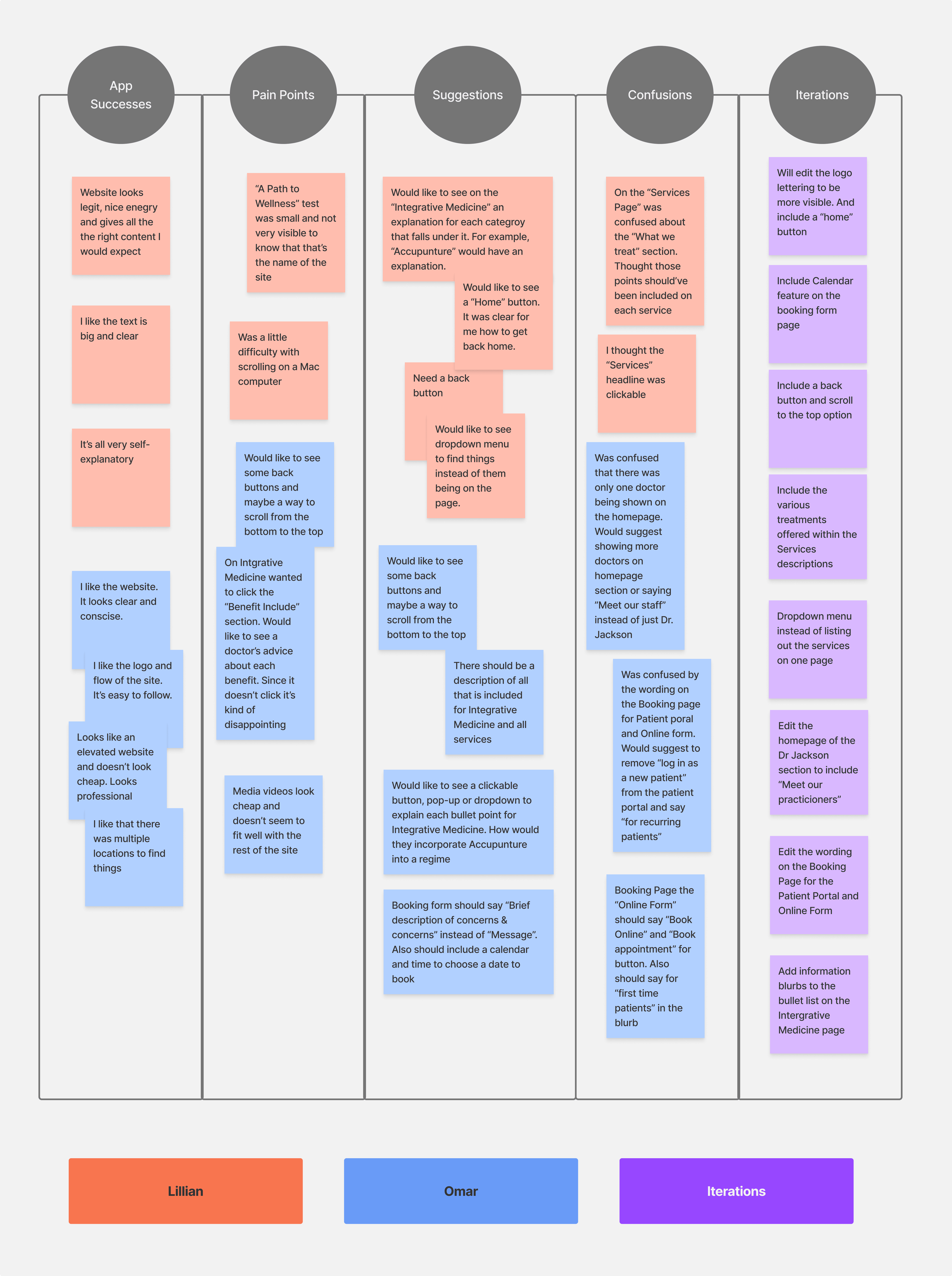
After conducting my usability tests, I created an affinity map with key insights, behaviors, and findings during the tests.
100% of participants completed the proposed tasks in under 10 minutes. All participants commented on the design’s credibility and professional look, complimenting the color palette, clear hierarchy, and information.
I assumed the layout and content was sufficient for the customer have a sense of confident to book an appointment. But I observed that more explanation of the services needed to be clearer & further explanations of those services needed to be outlined.
Successes
“Looks like an elevated website and doesn’t look cheap. Looks professional"
Pain Points
"Was confused that there was only one doctor being shown on the homepage. Would suggest showing more doctors on homepage section or saying ”Meet our staff” instead of just Dr. Jackson"
Improvements
Include Calendar feature on the booking form page
Insights
Revised Prototype
Based on observing users interacting with the prototype and the feedback I received, I prioritized these key changes:
Include a back button and scroll to the top option
Include the various treatments offered within each services descriptions
Edit wording on the Booking screen
Include a calendar feature on the booking form page

